

Mobile App
Mobile App
Case Study
Case Study
Getting Rid of Anchor Anxiety
How implementing the Swiss cheese model strategy elevated the overall value of the product and enabled captains to sleep like babies.
CLIENT
VisionAnchor
CJVT, University
of Ljubljana
YEAR
2023
TEAM SIZE
3 people
ROLE
Product Designer
(Contracted)




01
Project Context
Have you ever set sail and watched in awe as the captain dove into the water, only to check if the anchor truly held? Or have you ever awakened in the middle of the night, wondering if the shore was still the same distance away as when you fell asleep? As avid sailors themselves, the founders of VisionAnchor lived through all of these. Their question was obvious: "Is there a way to make the anchoring process smarter and help sailors eliminate anchor anxiety?"
About the Product
About the Product
About the Product
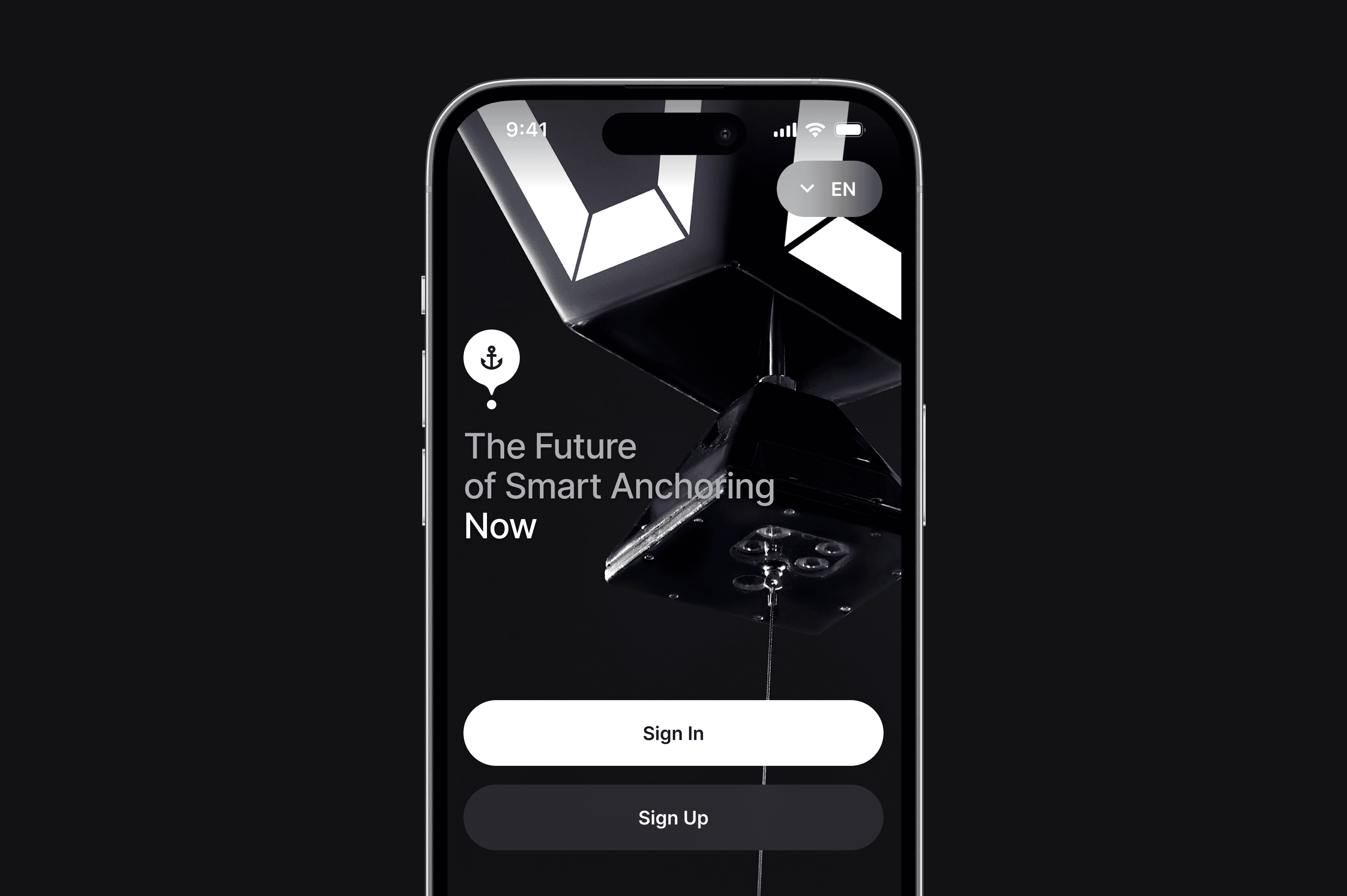
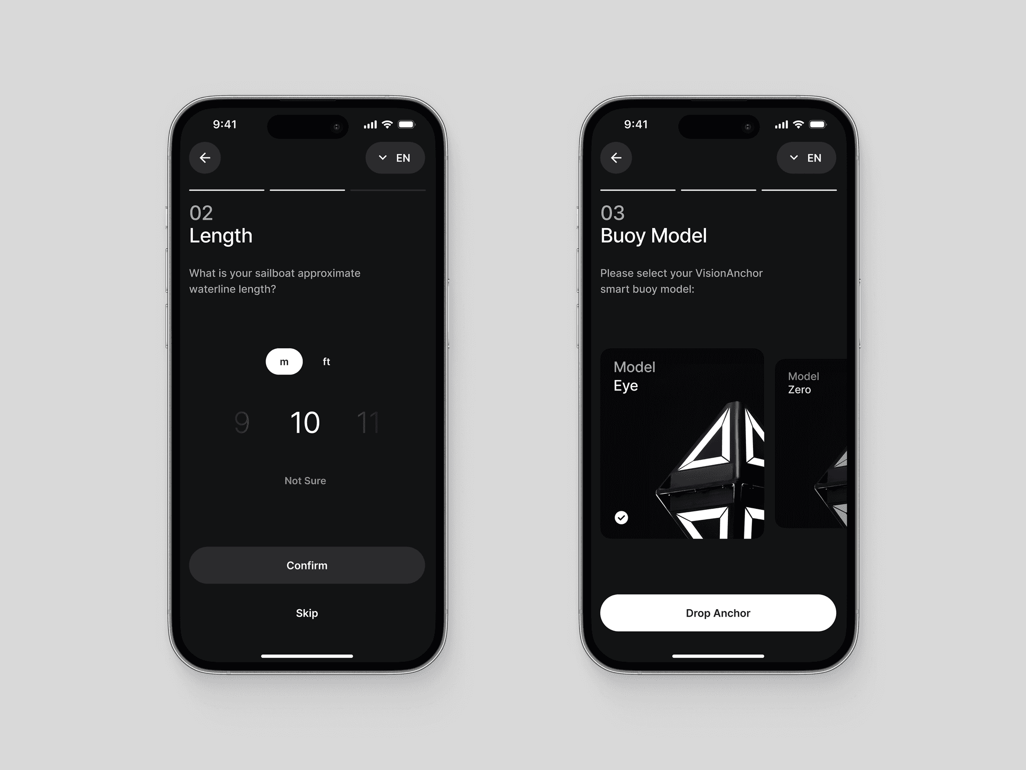
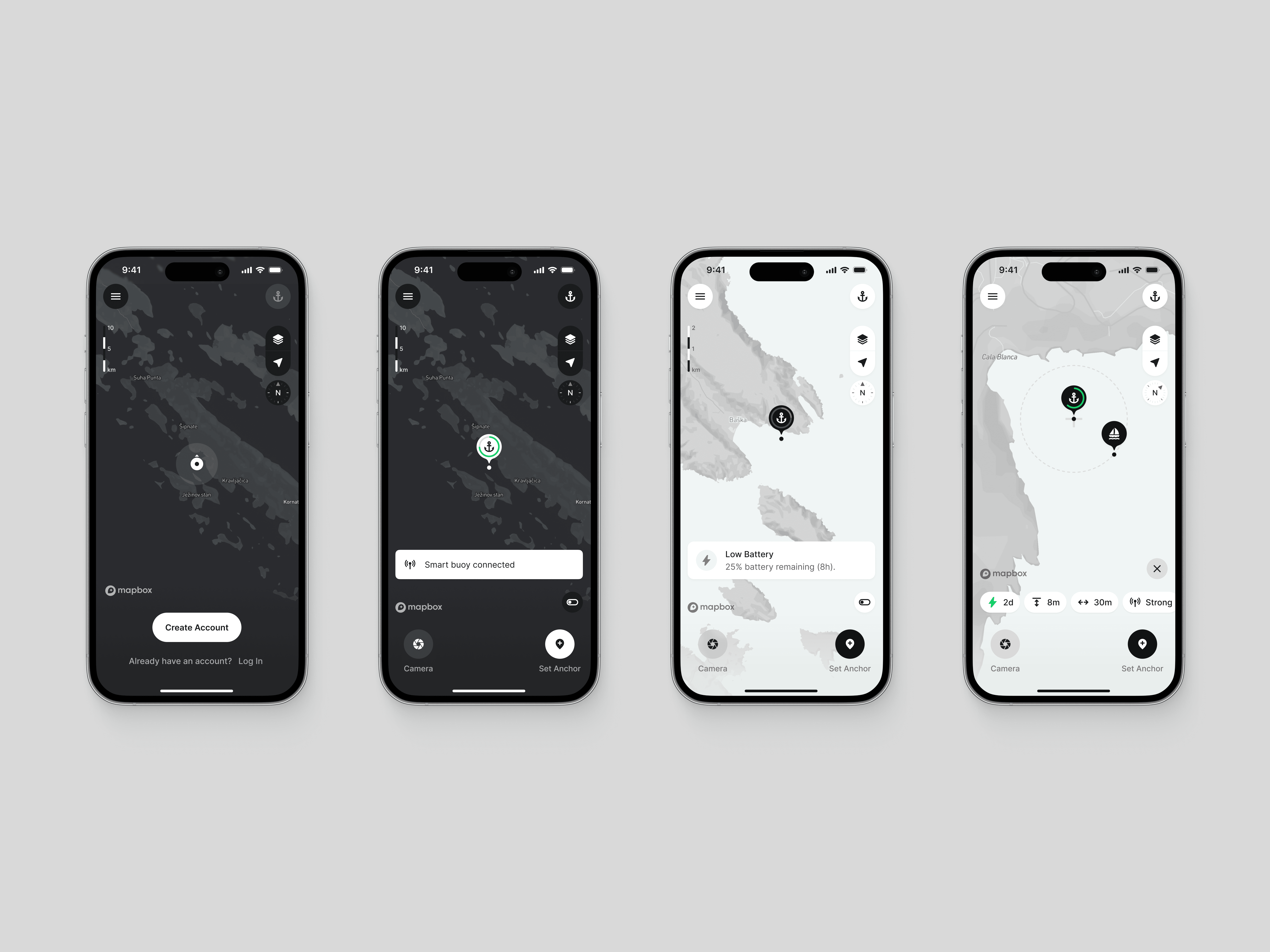
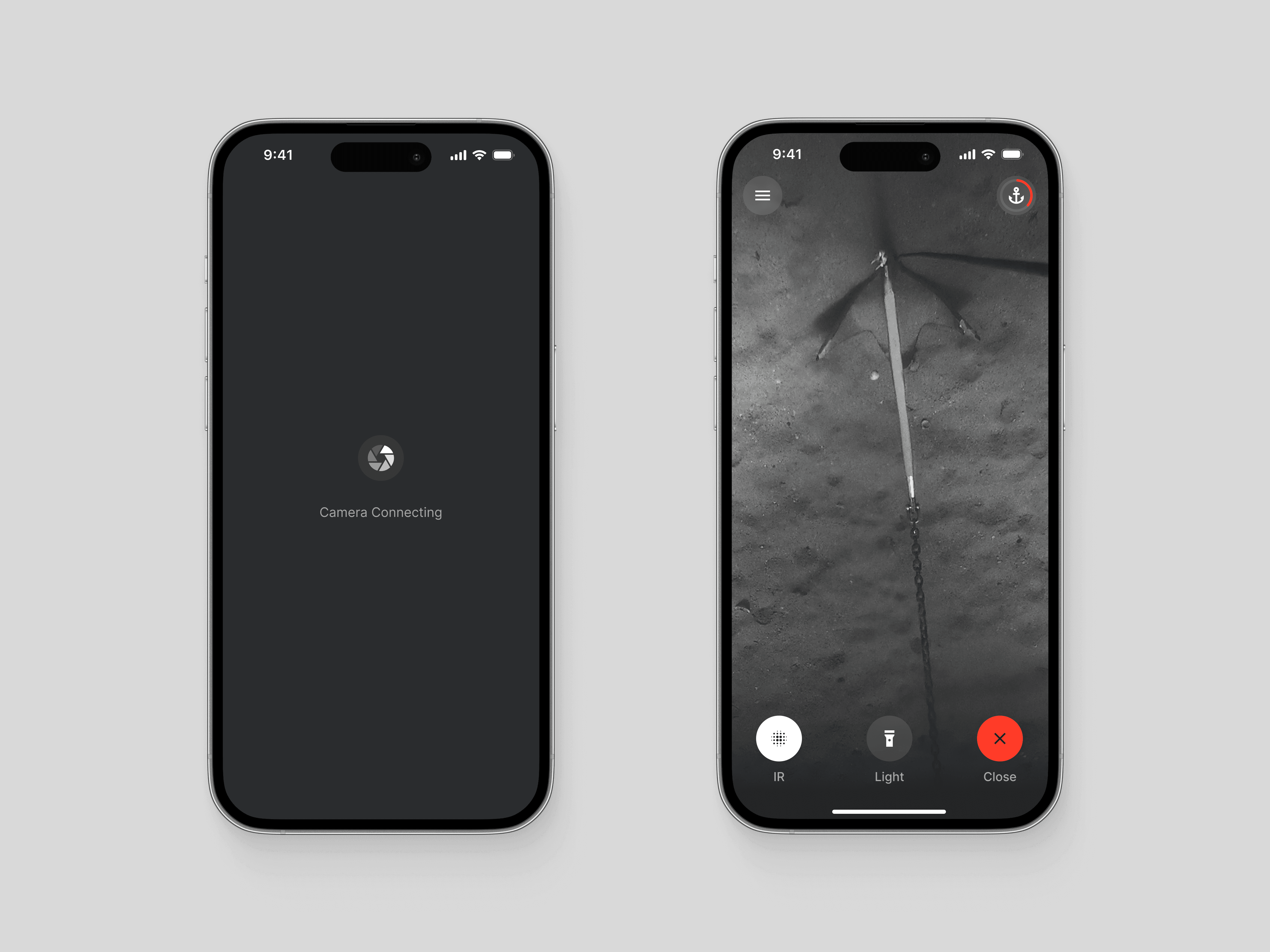
VisionAnchor is a smart anchoring system that integrates a smart anchor buoy, a vessel-mounted base unit, and an accompanying mobile app. It empowers captains to keep an eye on their anchor and vessel positions, receiving real-time updates and alerts if either deviates from the designated range. The advanced model features an integrated underwater camera, providing captains with a live visual assessment of the anchor at any time of the day.
VisionAnchor is a smart anchoring system that integrates a smart anchor buoy, a vessel-mounted base unit, and an accompanying mobile app. It empowers captains to keep an eye on their anchor and vessel positions, receiving real-time updates and alerts if either deviates from the designated range. The advanced model features an integrated underwater camera, providing captains with a live visual assessment of the anchor at any time of the day.
VisionAnchor is a smart anchoring system that integrates a smart anchor buoy, a vessel-mounted base unit, and an accompanying mobile app. It empowers captains to keep an eye on their anchor and vessel positions, receiving real-time updates and alerts if either deviates from the designated range. The advanced model features an integrated underwater camera, providing captains with a live visual assessment of the anchor at any time of the day.



02
My Role
As a contracted digital product designer I was responsible for the design of the app and was involved in all of the key design phases: internal strategy workshops, research, user interviews, information architecture, UX concept, primary usability validation, UI design, and the creation of a scalable components library. The app is scheduled to be released as part of the product launch in late 2024.
03
Highlights
Anchoring is a stressful procedure for captains of all trades. Product strategy is aimed at mitigating the so-called anchor anxiety before, during, and after the anchoring session. The product helps captains make more informed and correct decisions, minimizing the threat of potential accidents and, therefore, increasing the safety of the vessel and its crew. And, just in case, there is always a last resort: an anchor alarm.
Contextual Information
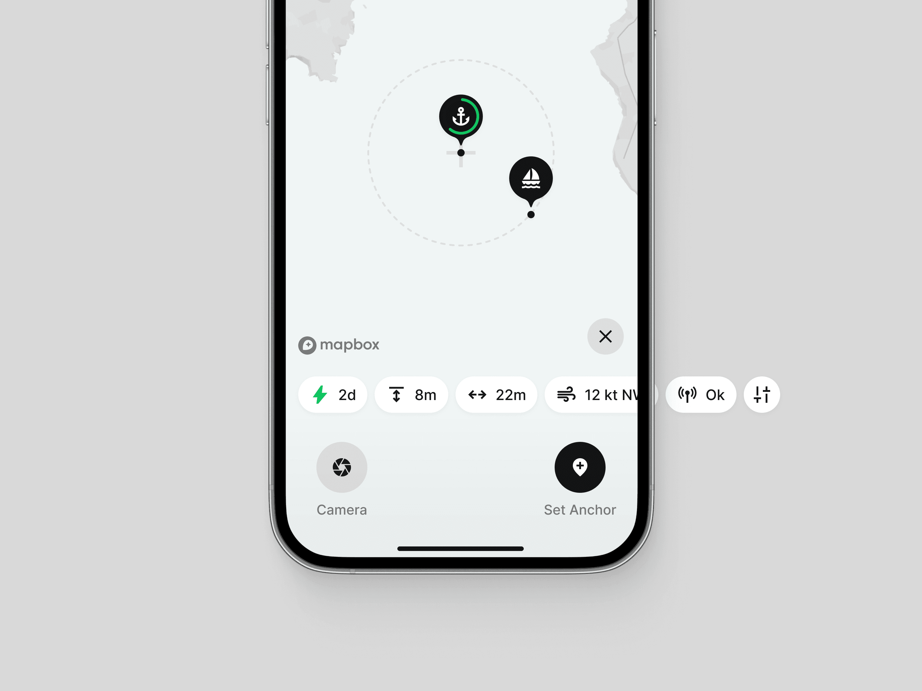
Instant access to buoy charge, anchor depth, and distance to the anchor empowers captains to make informed anchoring decisions.
Safety Area Selection
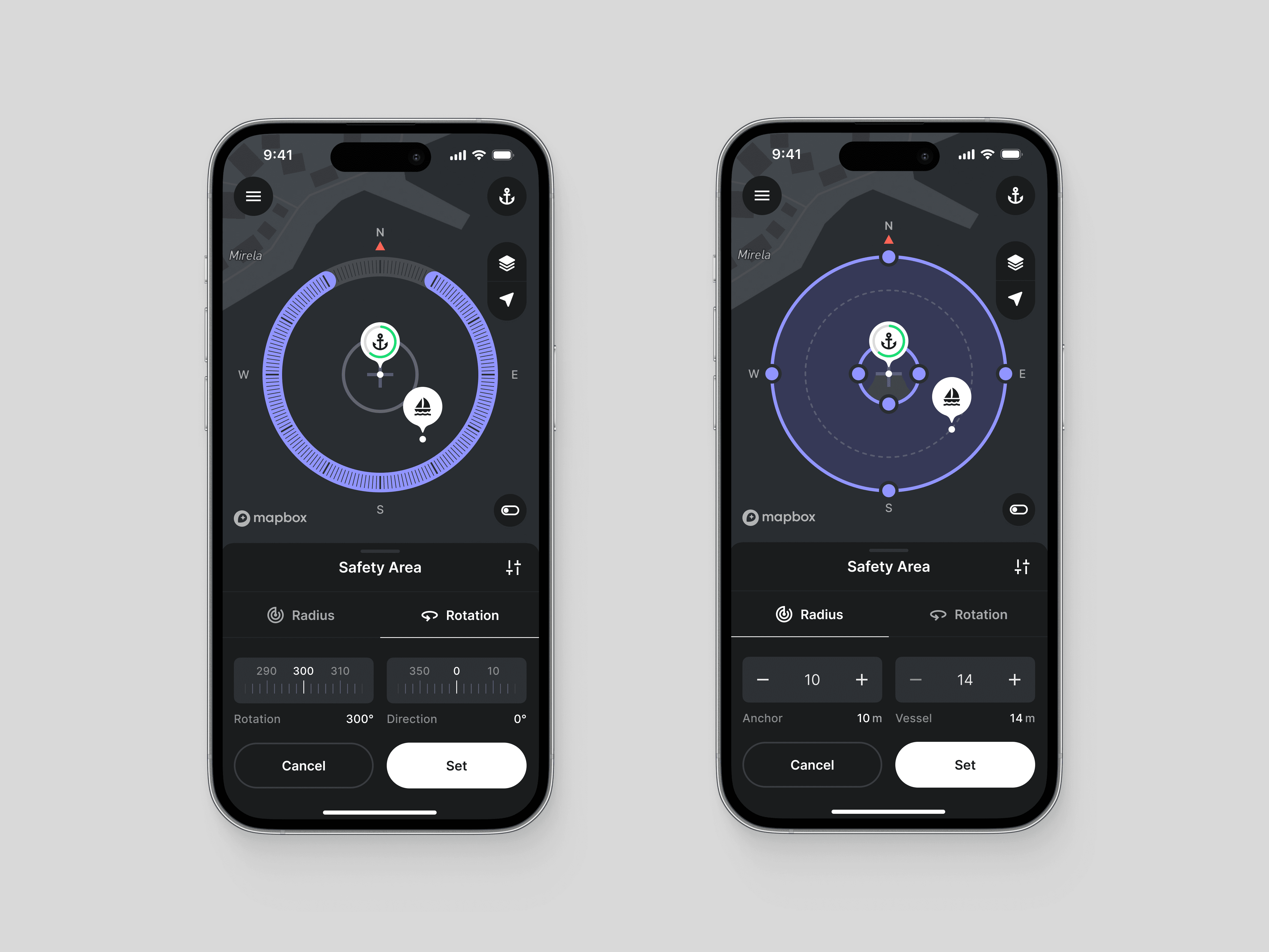
Selection of a safe anchoring area through precise and intuitive input of acceptable offset and rotation angle.
Monitoring Widgets
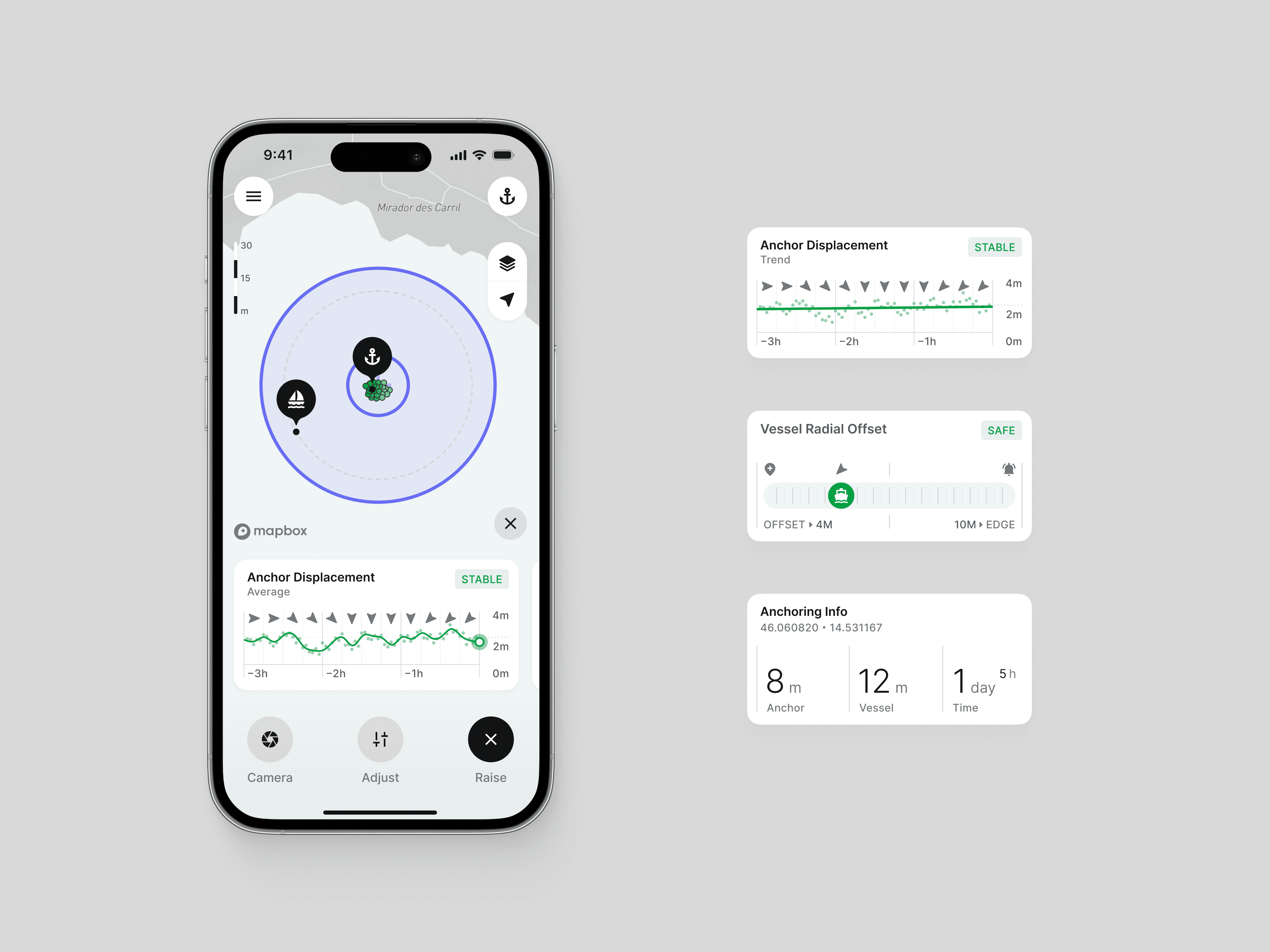
Transforming data into information to offer captains better insight to act beforehand.
Alerts and Alarm
Applying Swiss cheese model strategy to notify captains about potential danger.
Underwater Camera
Enabling captains to see first-hand what is going on with the anchor while keeping their swimsuits dry.
Day and Night Mode
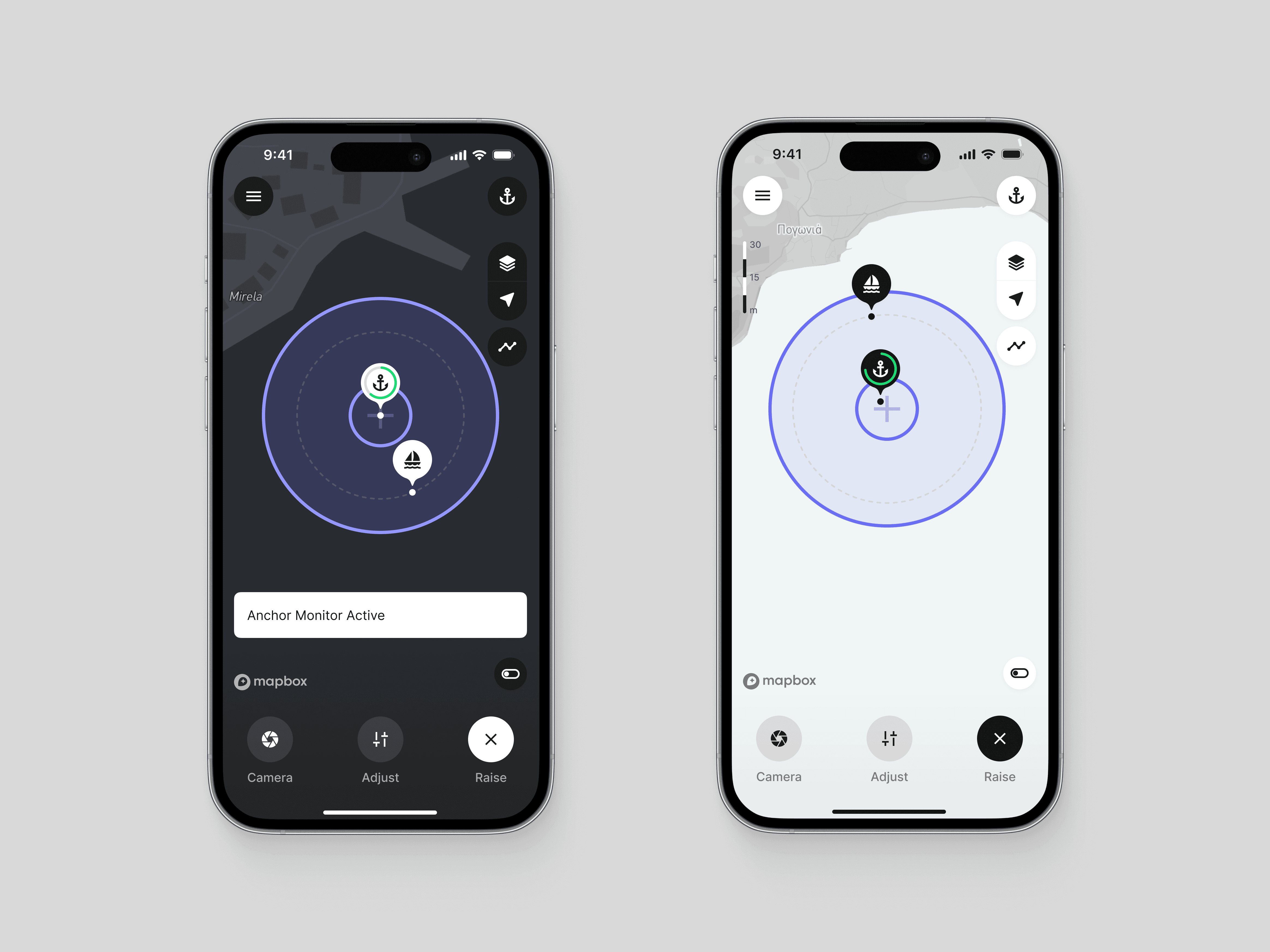
Making sure captains never get blinded again when anchoring in the evening hours or during the night.






04
User Research
The research phase proved to be fairly straightforward due to the product's validated market fit. This allowed me to direct my efforts toward understanding actual user needs, rather than primarily identifying user types and their potential use cases. The product is aimed toward regular private sailors with their own vessels on one hand and charter companies that can offer it to their customers as part of the vessel’s additional equipment on the other.


User Interviews
Since the idea for the product was born out of a personal pain point, the founders themselves were a pretty good source of information. Nevertheless, we additionaly invited two of my close contacts, both seasoned sailors, to participate in multiple rounds of user interviews that organically evolved into unofficial product consultations. The more informal setting fostered insightful, honest, and direct conversations.
Having a real-time information about the anchor depth would be incredibly valuable as the rope length directly depends on it.
Testimonial
The stretching of the anchor rope makes it nearly impossible to visually assess the anchor hold. I can only guess what is happening down there, even more so during the night.
Testimonial
The most annoying aspect of anchoring is that you can never be 100% sure that everything is okay.
Testimonial
Rethinking Product Strategy
Rethinking Product Strategy
Rethinking Product Strategy
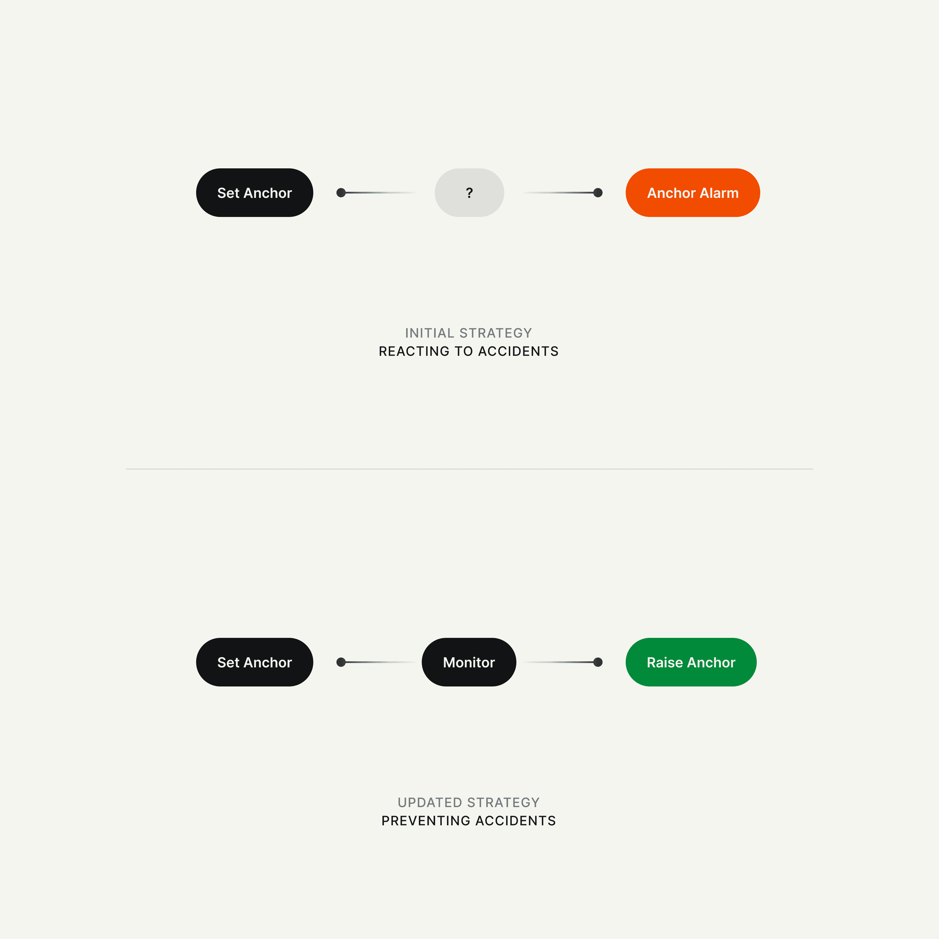
Based on user research, I proposed a slight shift in the overall product strategy, transitioning from reacting to preventing anchoring accidents. Despite the seemingly subtle nature of the adjustment, it marked a significant leap in terms of the perceived value it provides.
As a result, the product evolved from a simple anchor alarm to an anchoring assistant, empowering users to identify and prevent anchoring accidents long before they occur.

05
Connecting the Dots
05
Connecting the Dots
05
Connecting the Dots
05
Connecting the Dots
User Journey Mapping
User Journey Mapping
User Journey Mapping
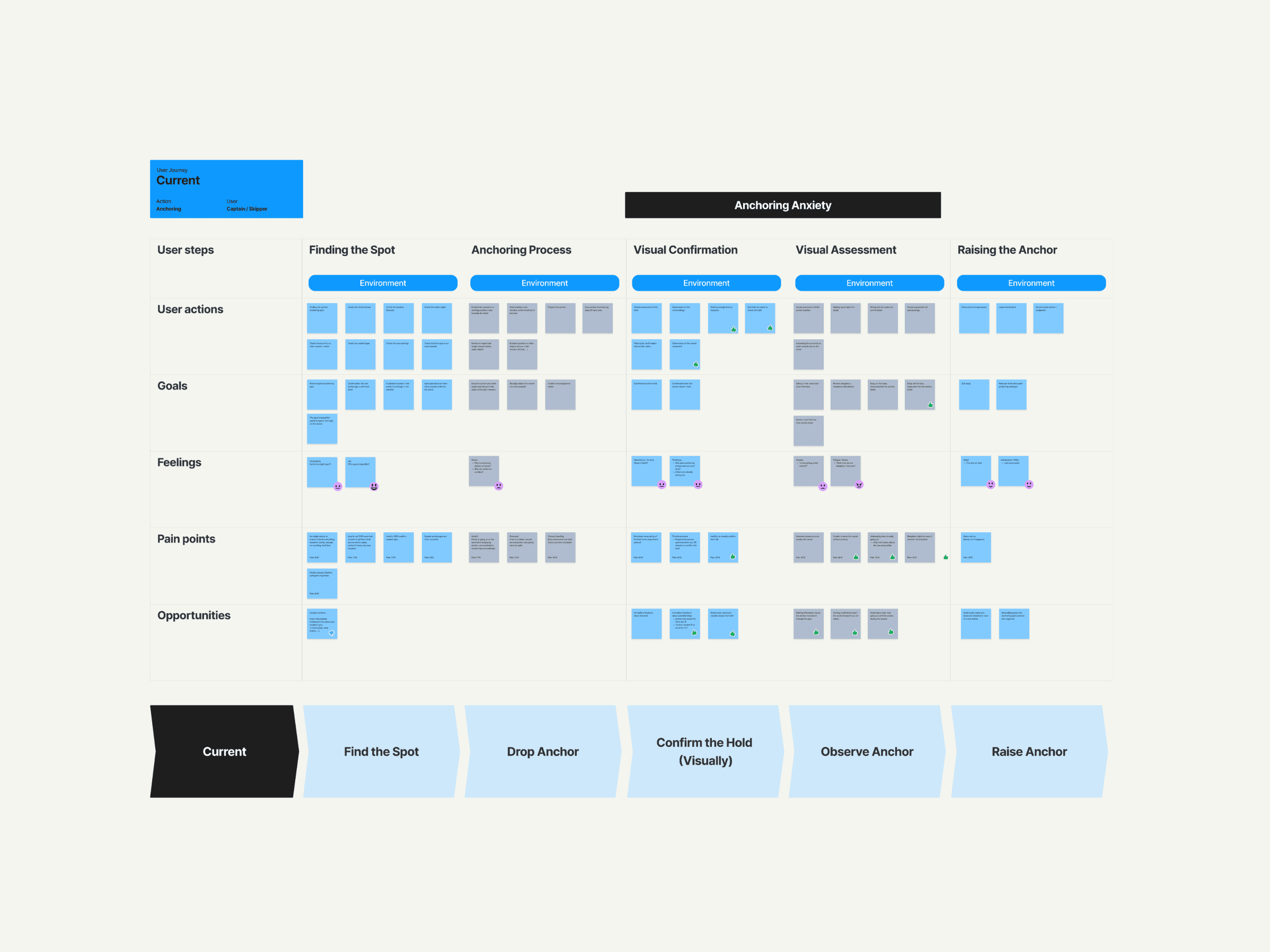
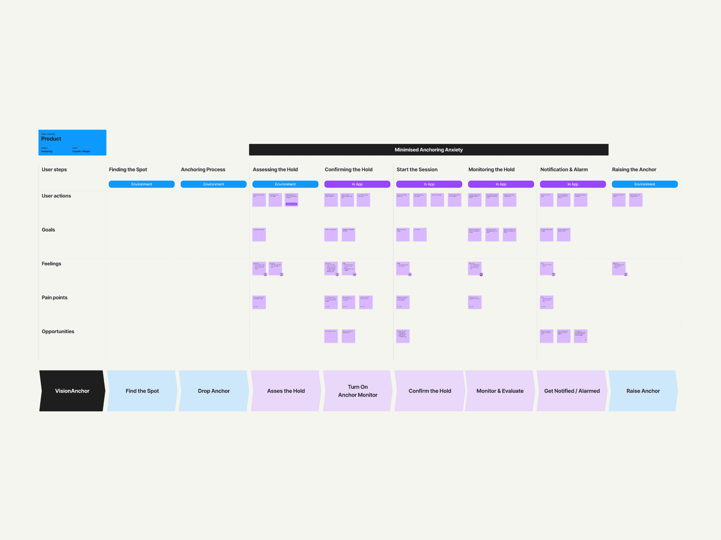
To get a clearer idea of how specifically our product fits within the anchoring process, we analyzed "as-is" and "to-be" user journeys. Understanding the real-life sequence of events helped us hone our focus on our key mission: empowering users to overcome anchor anxiety.
This clarified that our mission, as an anchor displacement tracker isn't to replace existing specialized nautical tools, like depth or currents radar, but rather to complement them. This understanding proved invaluable when deciding which features to prioritize in the product.
Flowchart & See-Do Diagram
Flowchart & See-Do Diagram
Flowchart & See-Do Diagram
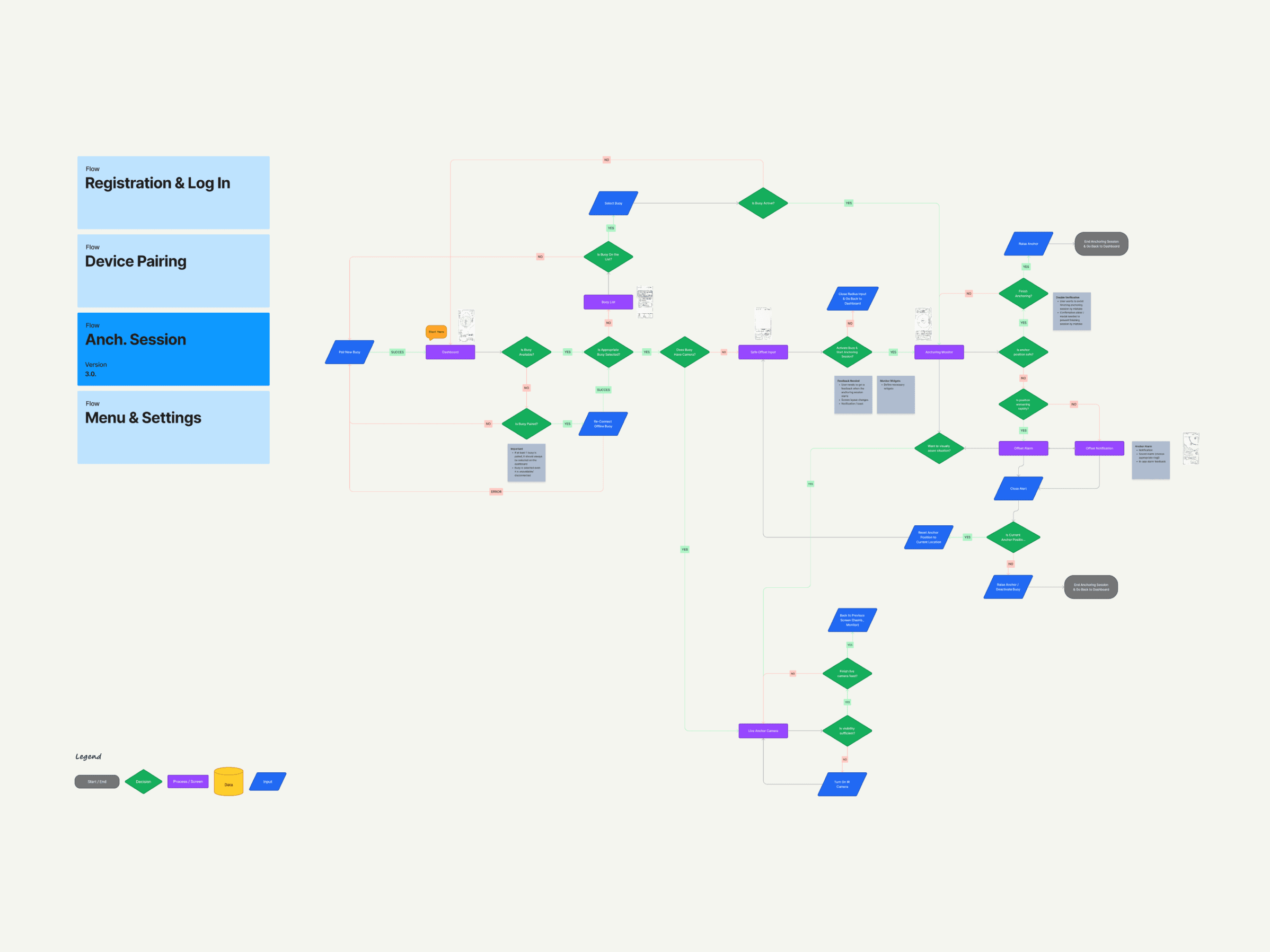
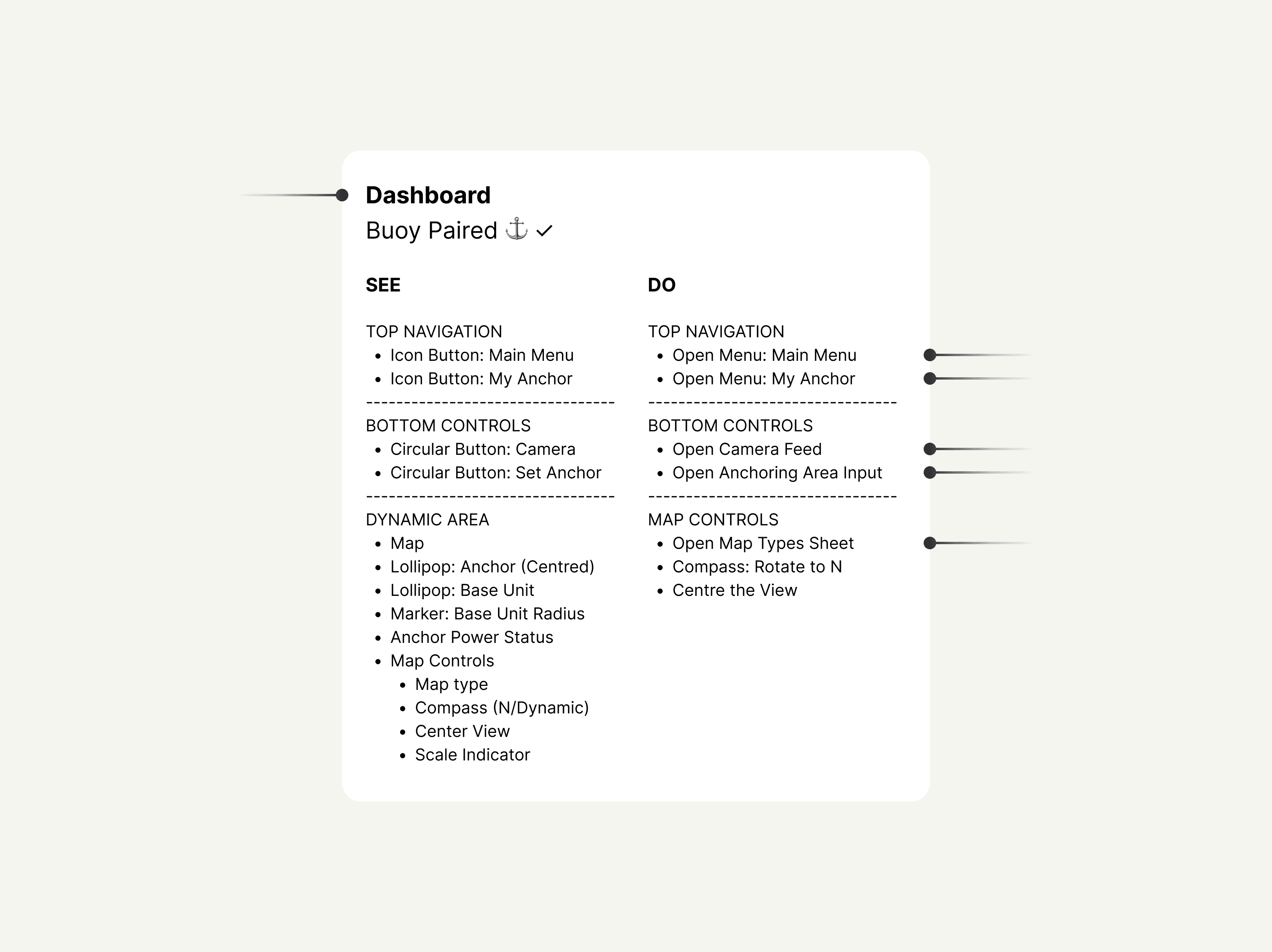
Several iterations of the flowchart enabled us to pinpoint key flows, list majority of screens, and map out key decision points. However, it was the see-do diagram that truly was a game changer. Introduced by Dan Winer, this technique falls somewhere between a flowchart and wireframes. Used for the first time, it allowed me to efficiently outline what users can see and do on each screen. Compared to wireframes, it still provided all the content and context, but without getting bogged down in the time-consuming pitfall of pixel-perfecting wireframes (which, if I'm honest, happens often).
Several iterations of the flowchart enabled us to pinpoint key flows, list majority of screens, and map out key decision points. However, it was the see-do diagram that truly was a game changer. Introduced by Dan Winer, this technique falls somewhere between a flowchart and wireframes. Used for the first time, it allowed me to efficiently outline what users can see and do on each screen. Compared to wireframes, it still provided all the content and context, but without getting bogged down in the time-consuming pitfall of pixel-perfecting wireframes (which, if I'm honest, happens often).
Several iterations of the flowchart enabled us to pinpoint key flows, list majority of screens, and map out key decision points. However, it was the see-do diagram that truly was a game changer. Introduced by Dan Winer, this technique falls somewhere between a flowchart and wireframes. Used for the first time, it allowed me to efficiently outline what users can see and do on each screen. Compared to wireframes, it still provided all the content and context, but without getting bogged down in the time-consuming pitfall of pixel-perfecting wireframes (which, if I'm honest, happens often).




Comparative Assessment
Comparative Assessment
Comparative Assessment
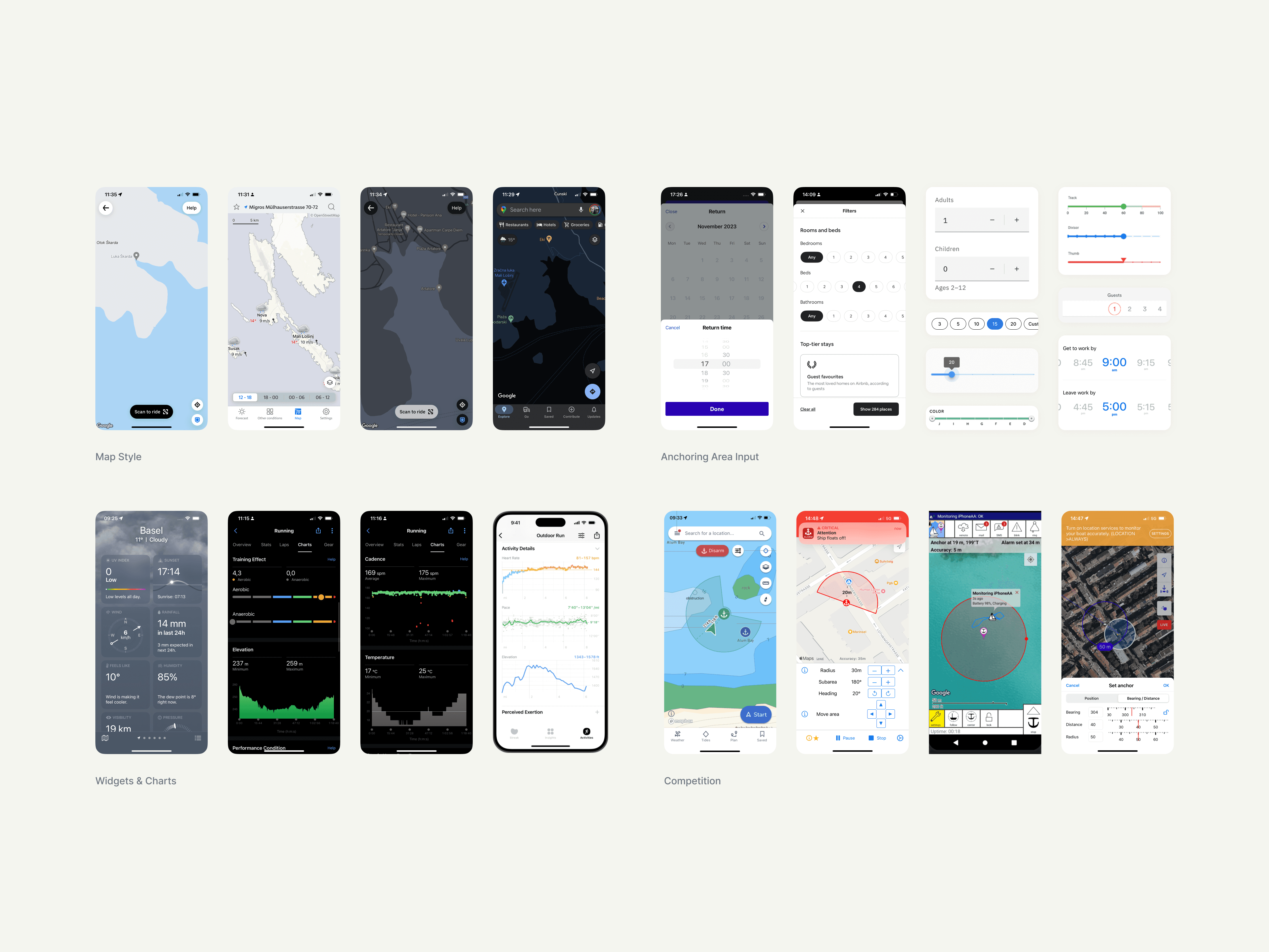
Before delving into the execution, I conducted a comprehensive comparative analysis of direct competitors, similar nautical products, and other relevant apps. I paid particular attention to identifying and mapping related usability patterns and features, such as the use of interactive maps, pairing functionality, camera feeds, data visualization techniques, and other relevant aspects.
To establish a clear visual direction, we created a visual mood board, which served as a valuable tool to align the team around the overall visual style strategy for the product.

06
Key Features
06
Key Features
06
Key Features
Monitor Widgets
Monitor Widgets
Monitor Widgets
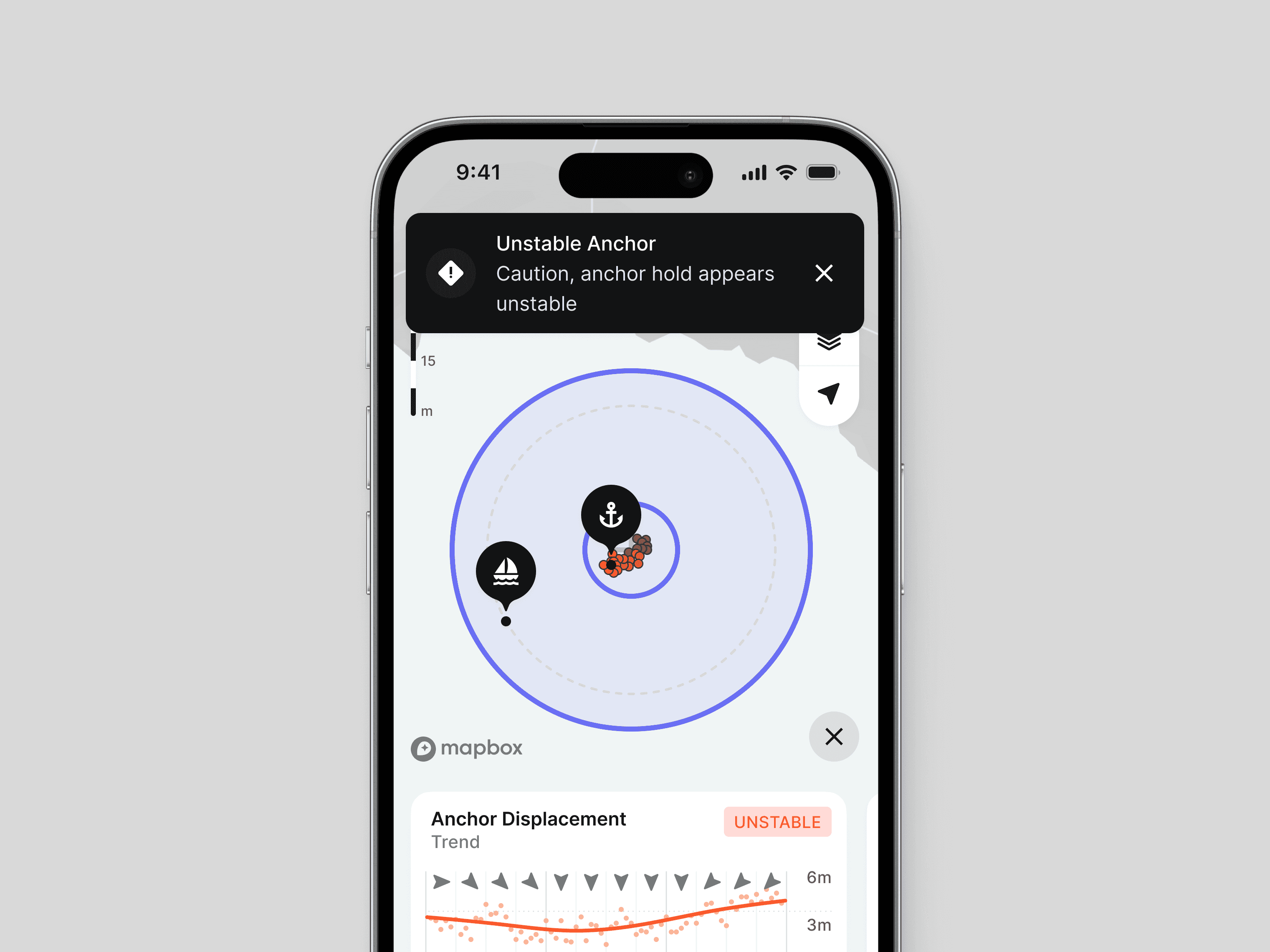
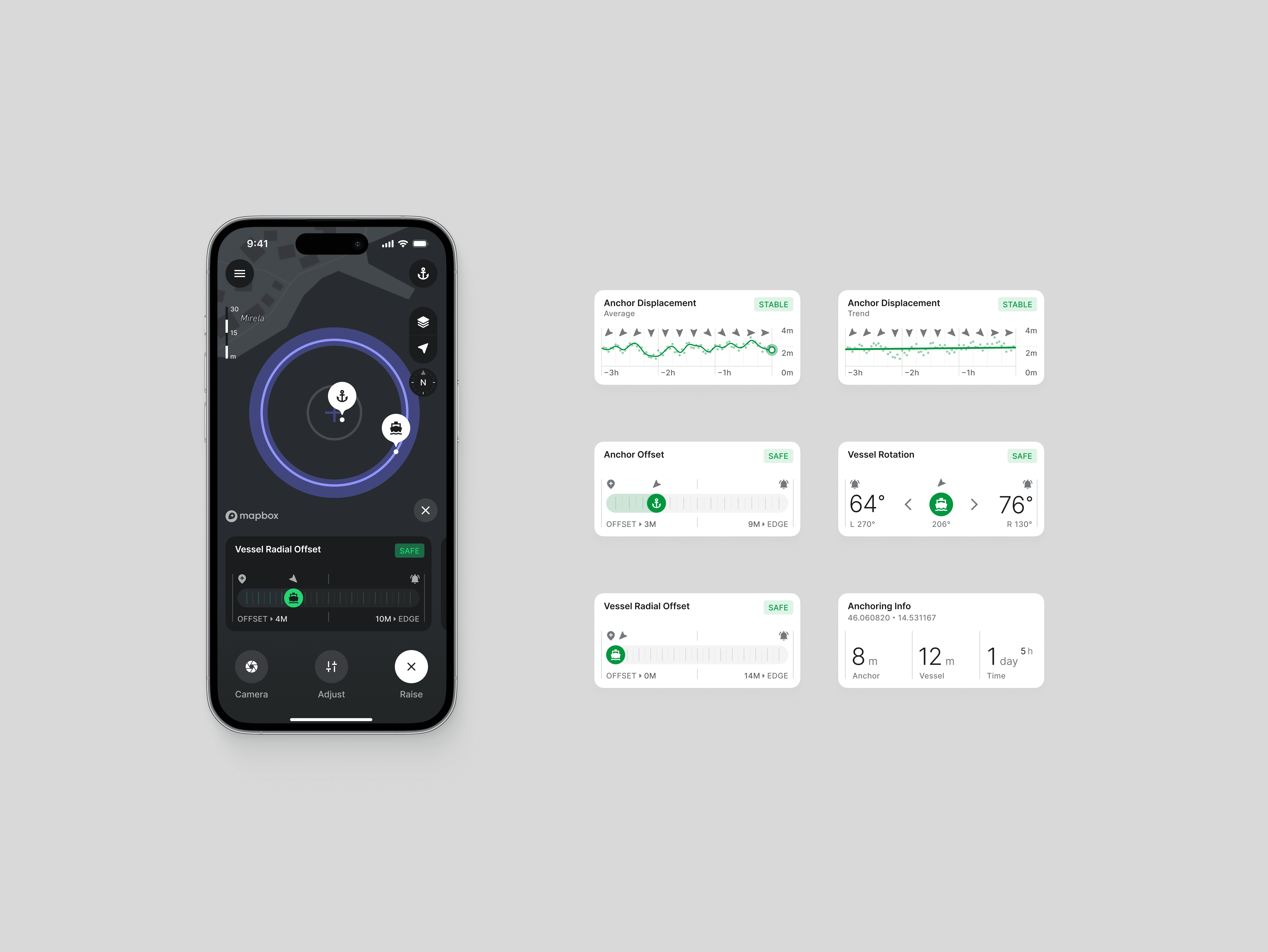
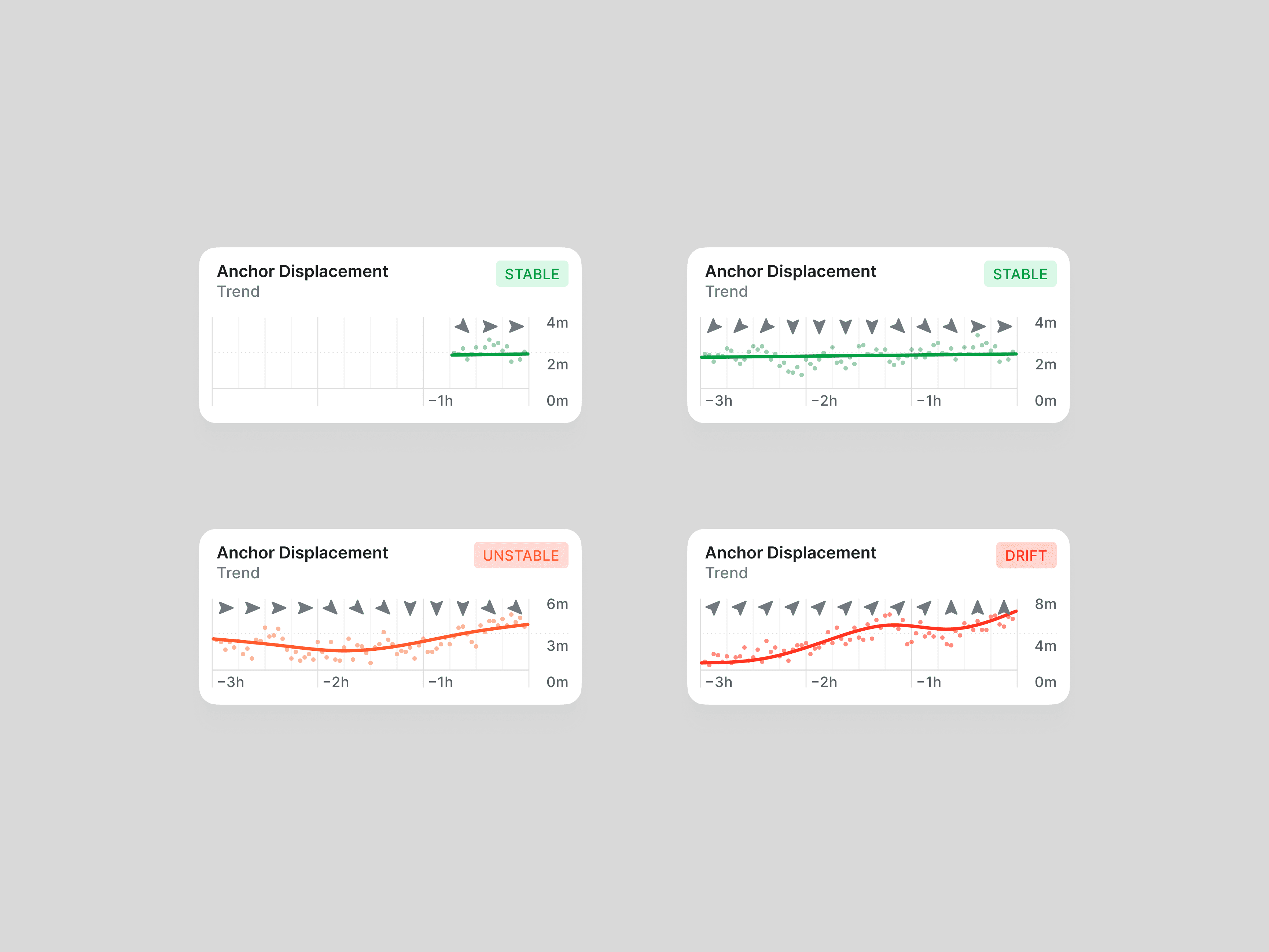
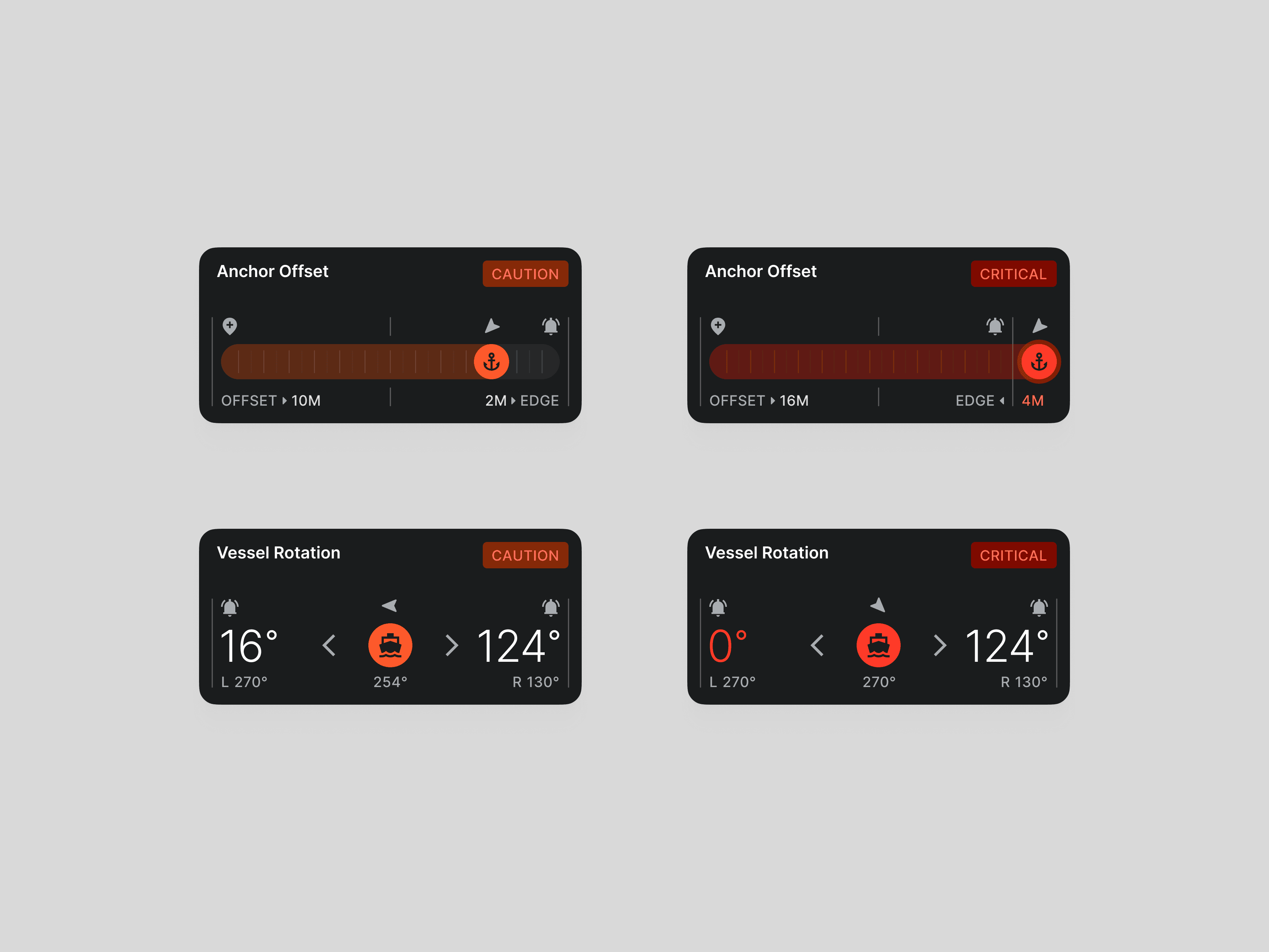
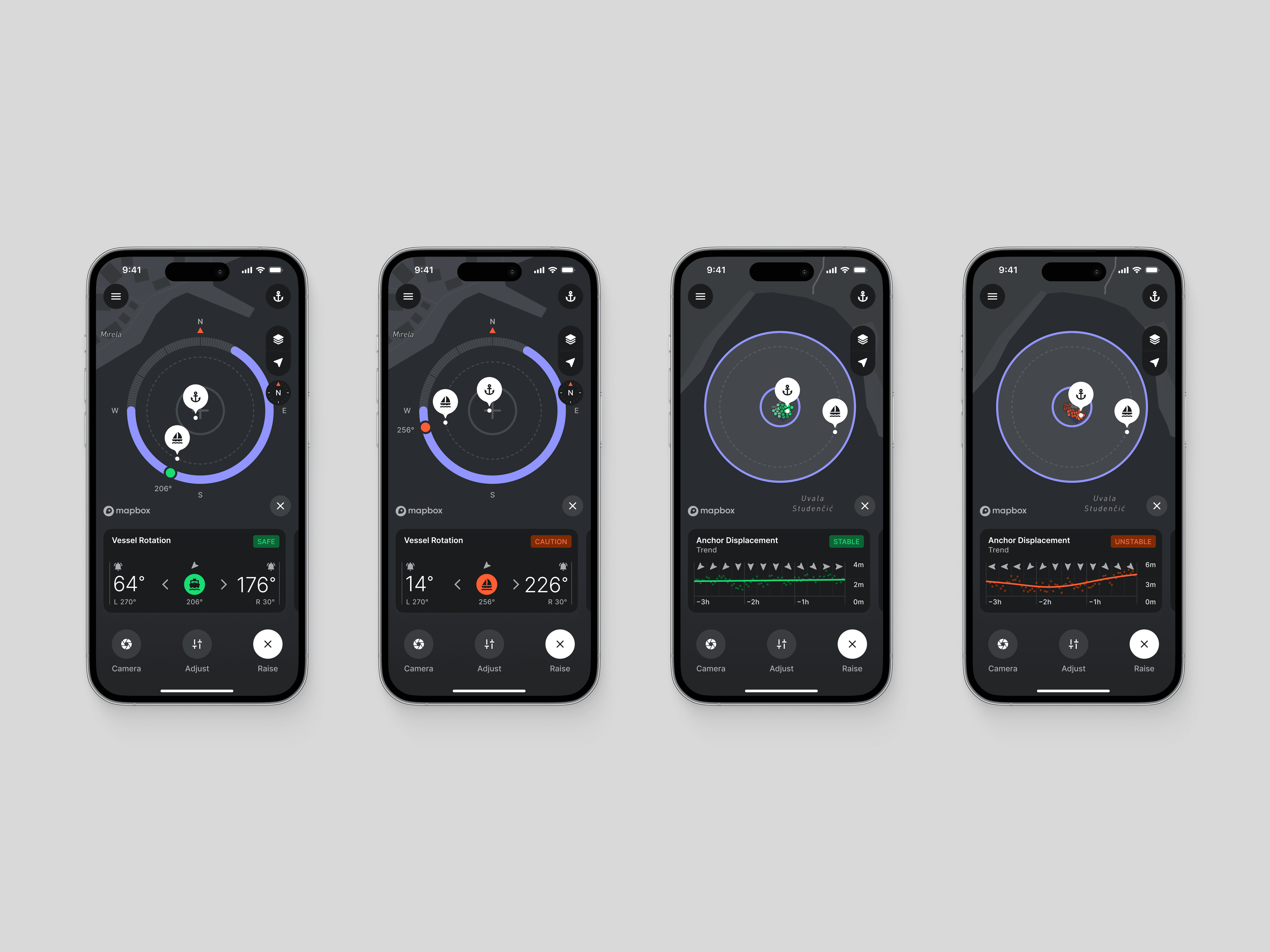
The shift in product strategy (from reacting to preventing accidents) is most evident during an active anchoring session. Monitor widgets allow users to assess the situation and identify potential threats. Through the "Swiss-cheese model" approach, dangerous situations can be identified and prevented before they occur.
Of particular value is the "Anchor Displacement Trend" widget. It alerts users if the average anchor displacement rate remains stable or increases over time. In such cases, the system triggers an anchor alert (not alarm). Other widgets contain information such as anchor and vessel offset, vessel rotational offset and average anchor offset over time.




Safety Area Selection
Safety Area Selection
Safety Area Selection
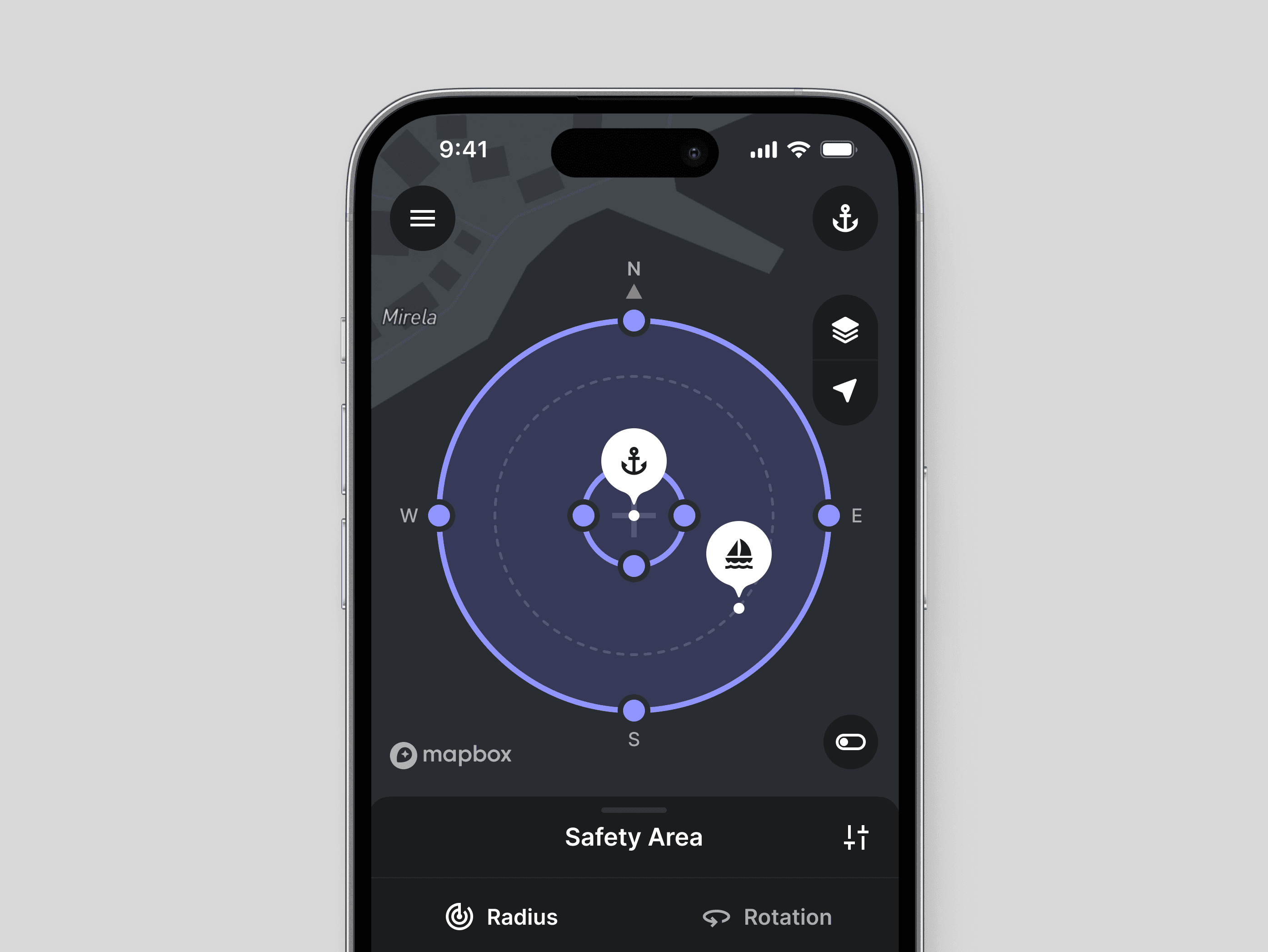
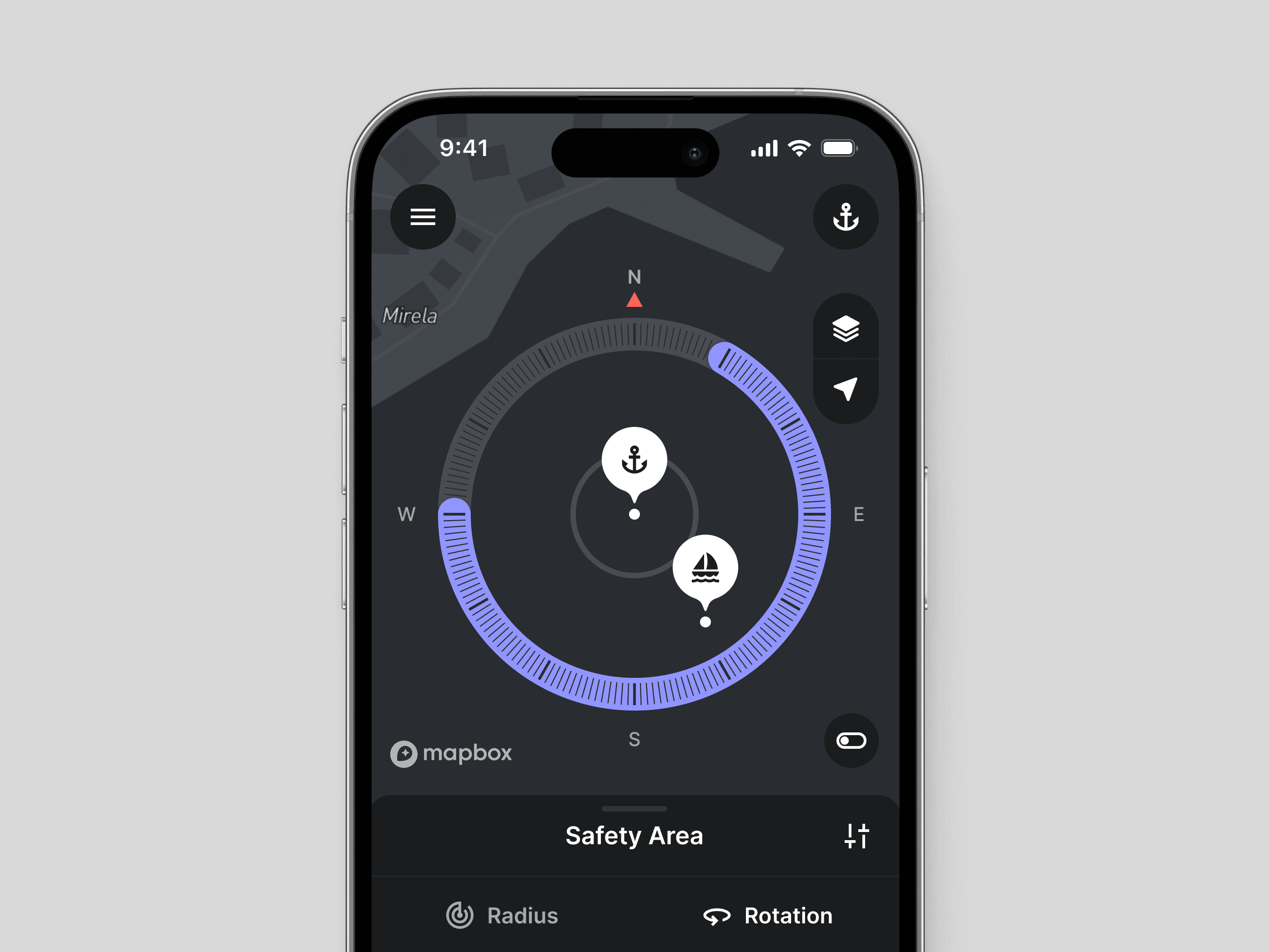
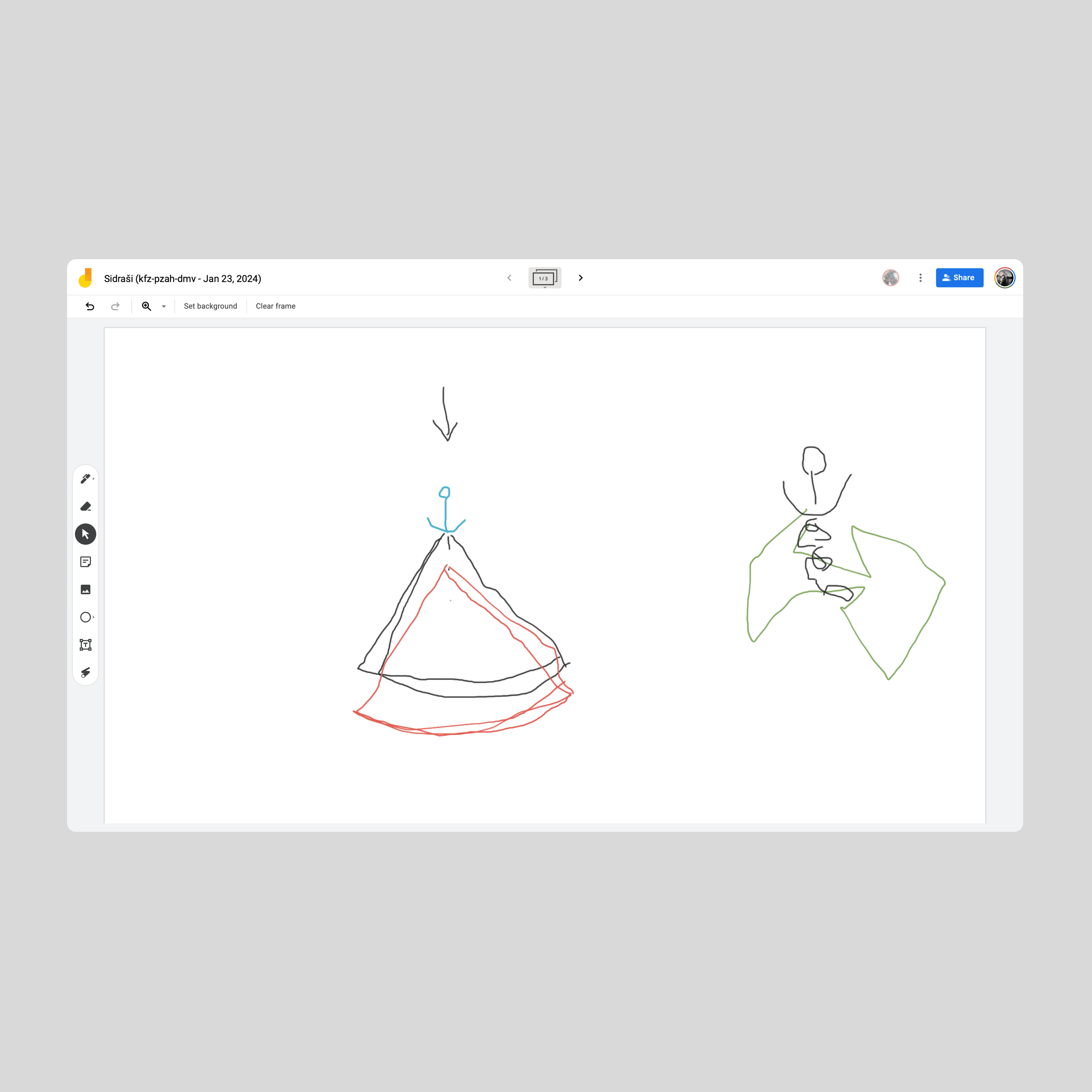
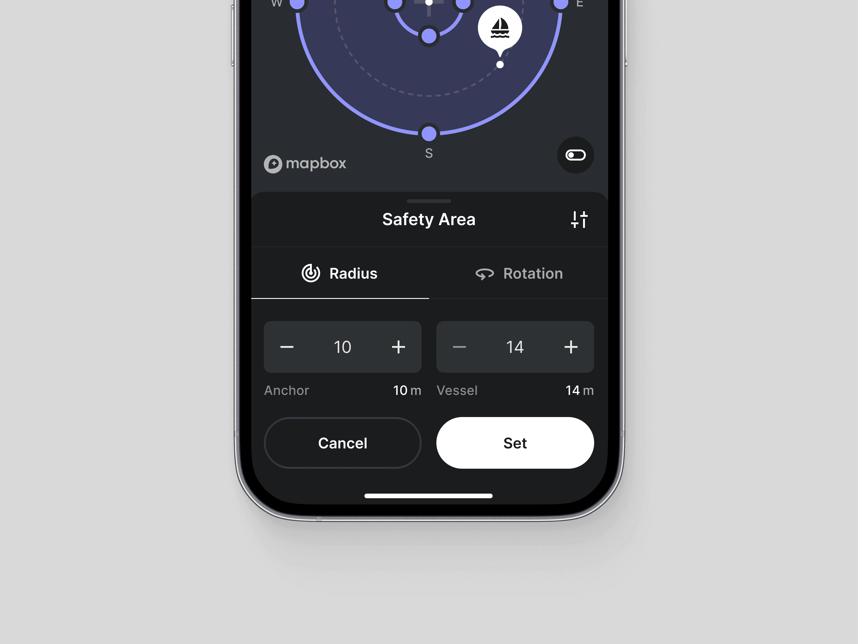
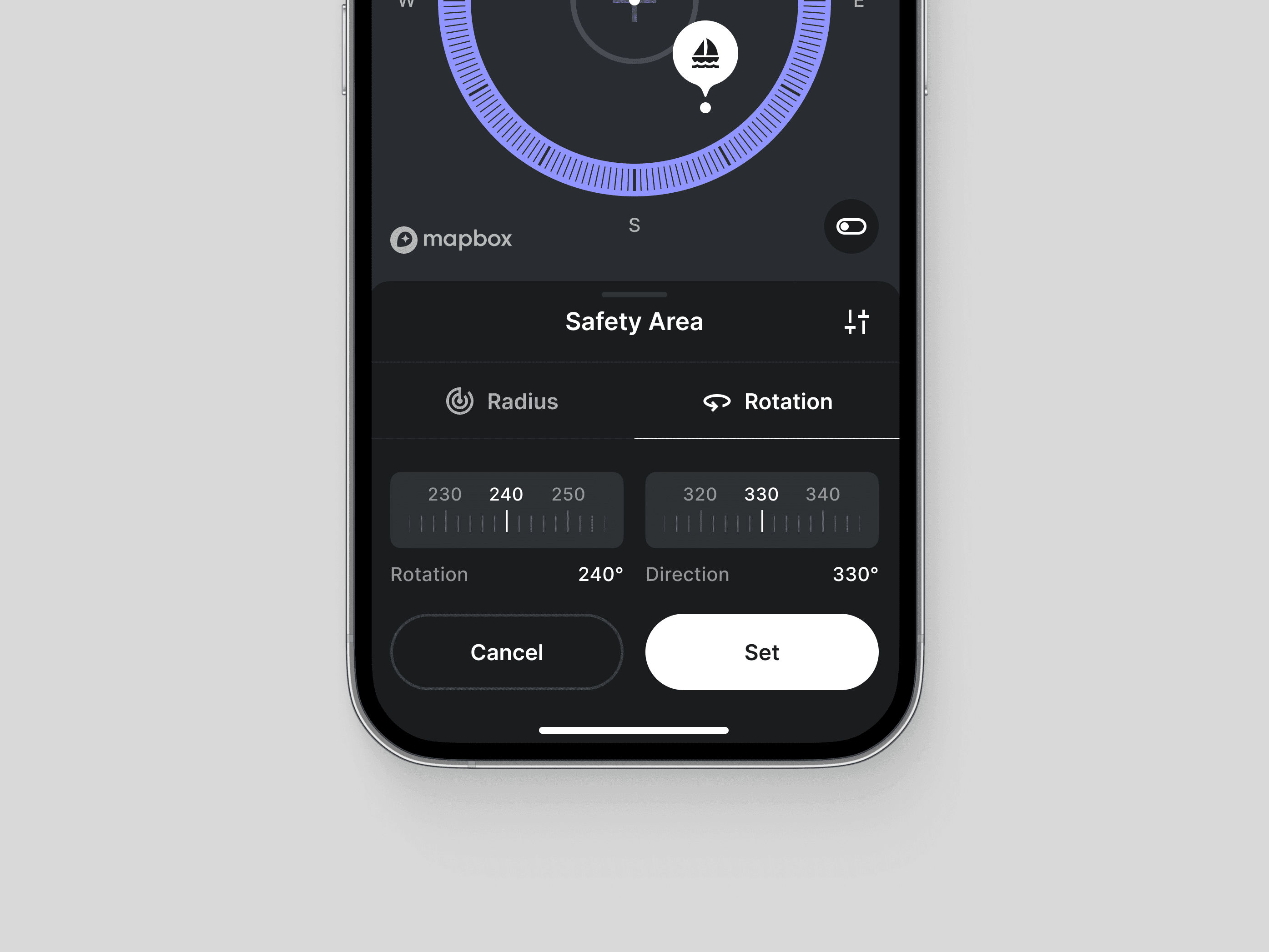
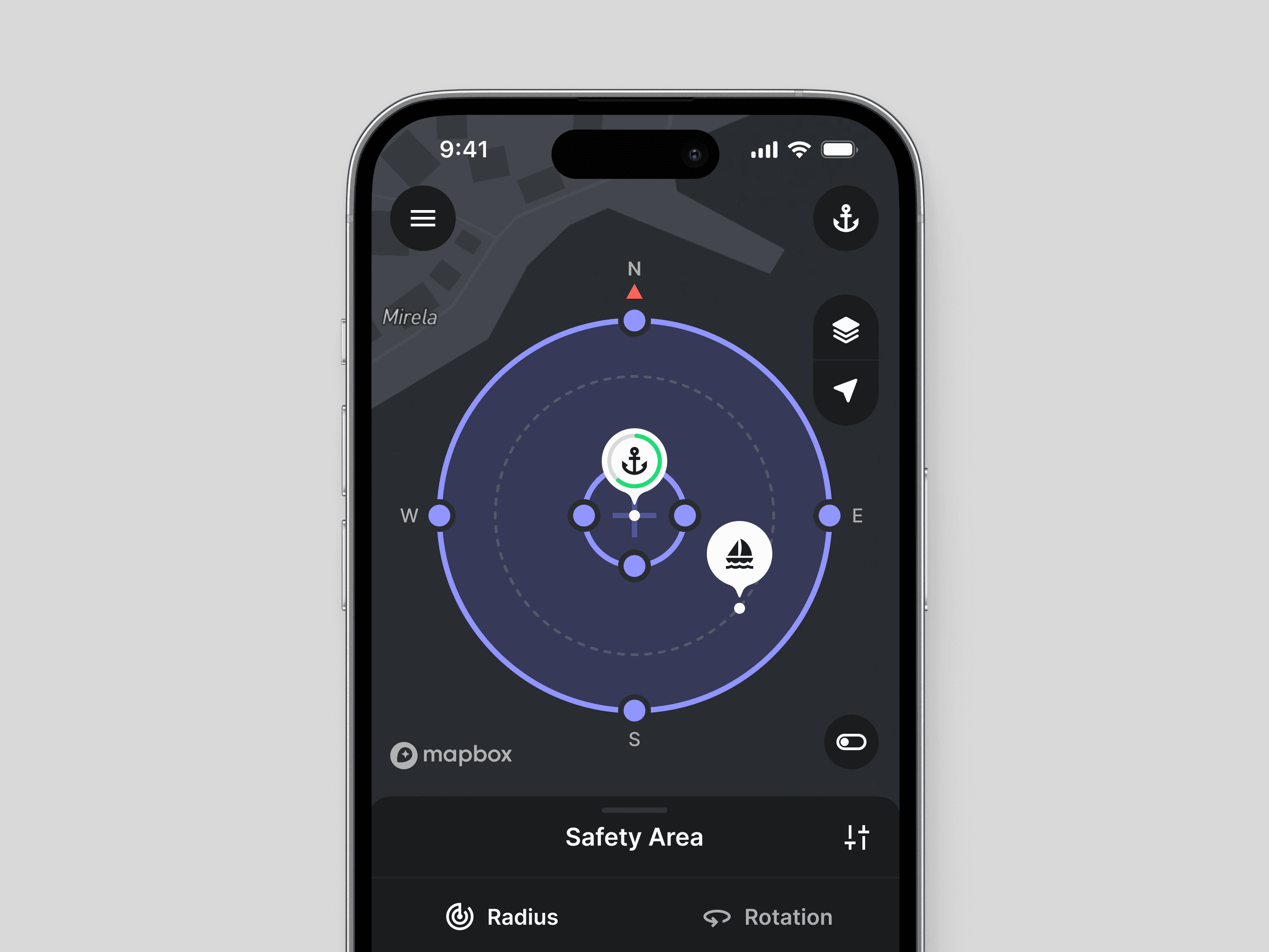
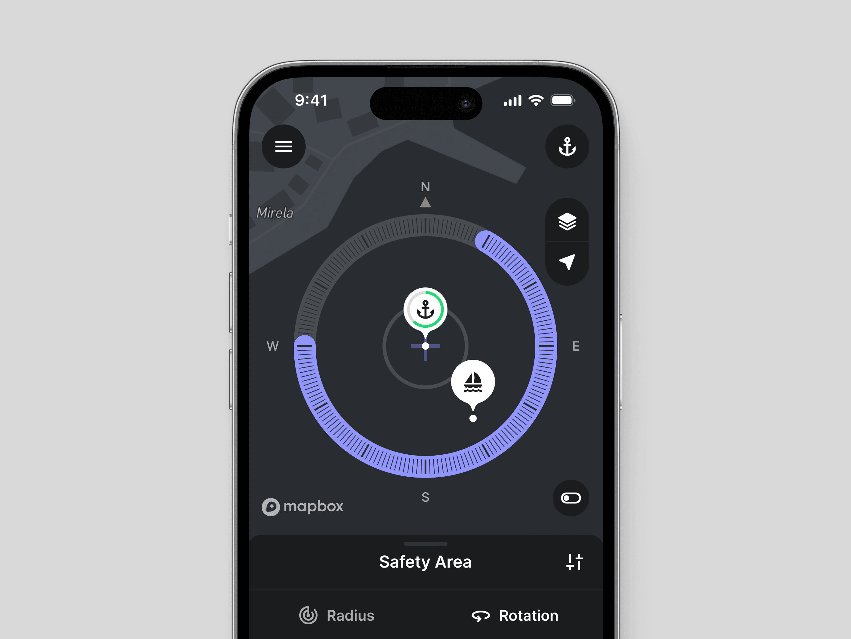
The selection of an anchoring area is typically impacted by the wind forecast. When winds are calm, anchorage options are nearly unlimited, making vessel rotation less critical. Conversely, in windy conditions, captains prioritize anchoring in downwind positions, closer to the shore. In this case, they need to be able to choose the maximum allowable vessel rotation and direction to avoid collisions.
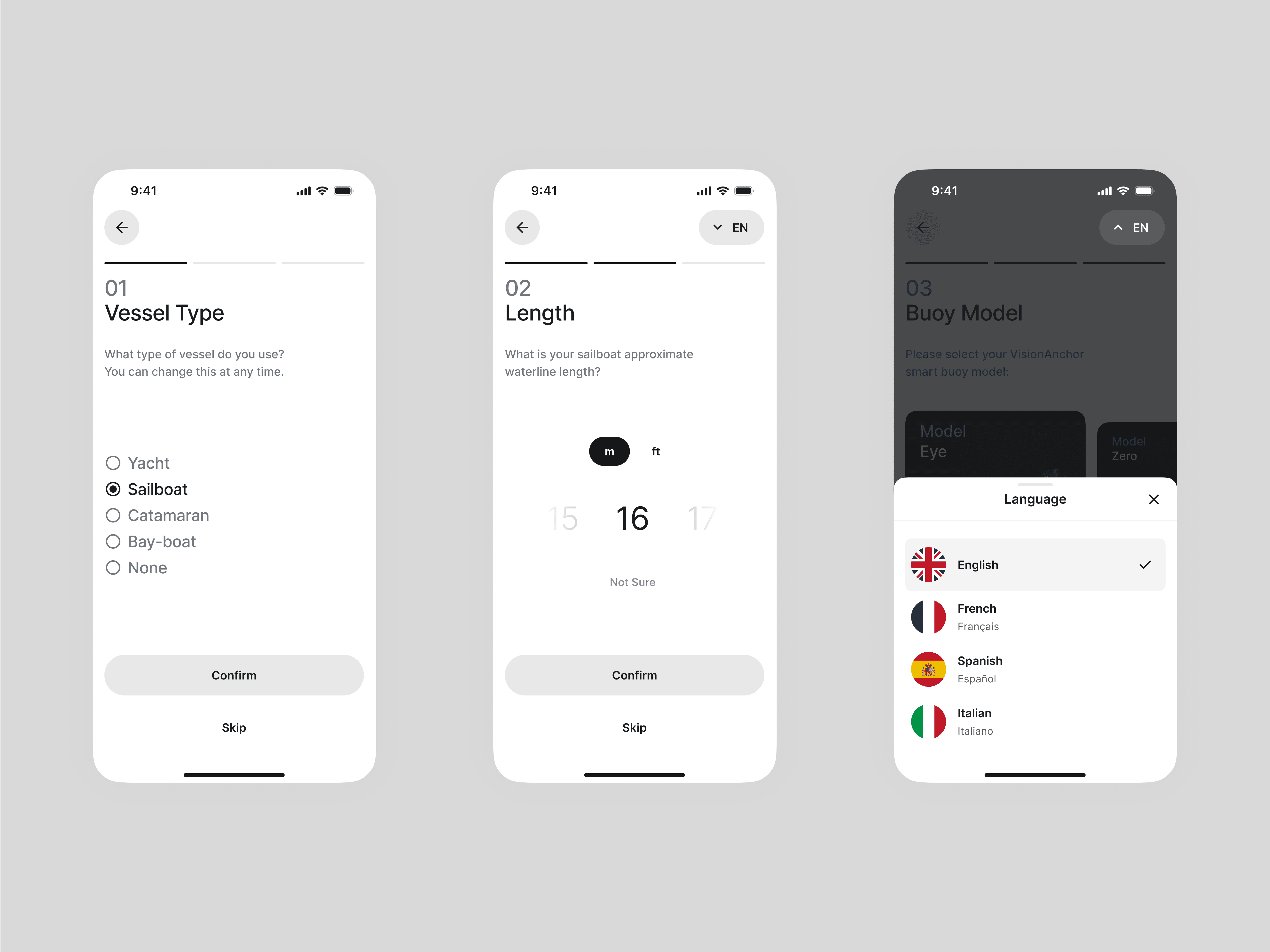
To streamline selection and reduce clutter, I've divided the inputs into two sections, treating vessel rotation as an advanced option. Both inputs can also be manipulated directly on the map.
Limiting Errors
Limiting Errors
Limiting Errors
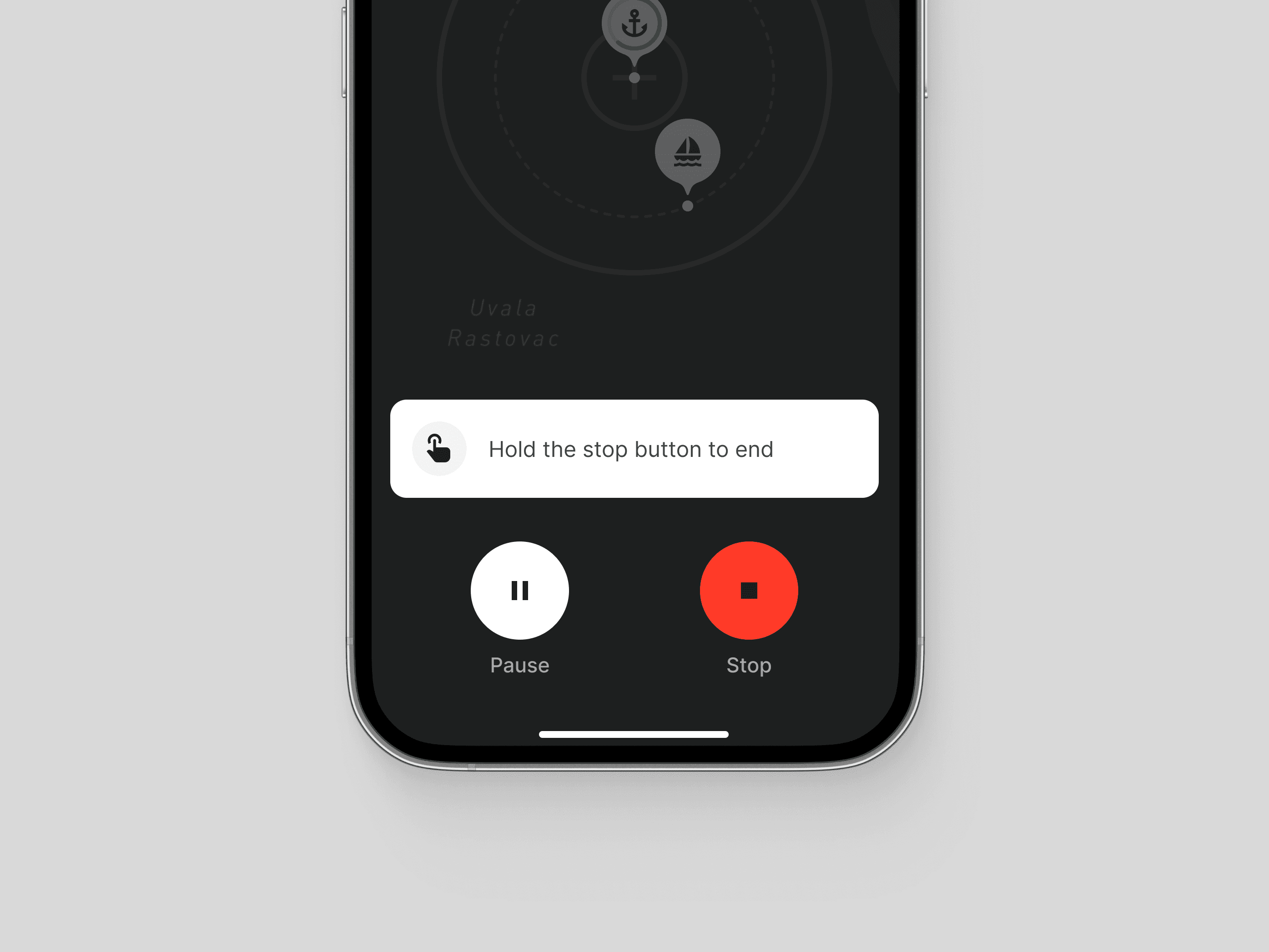
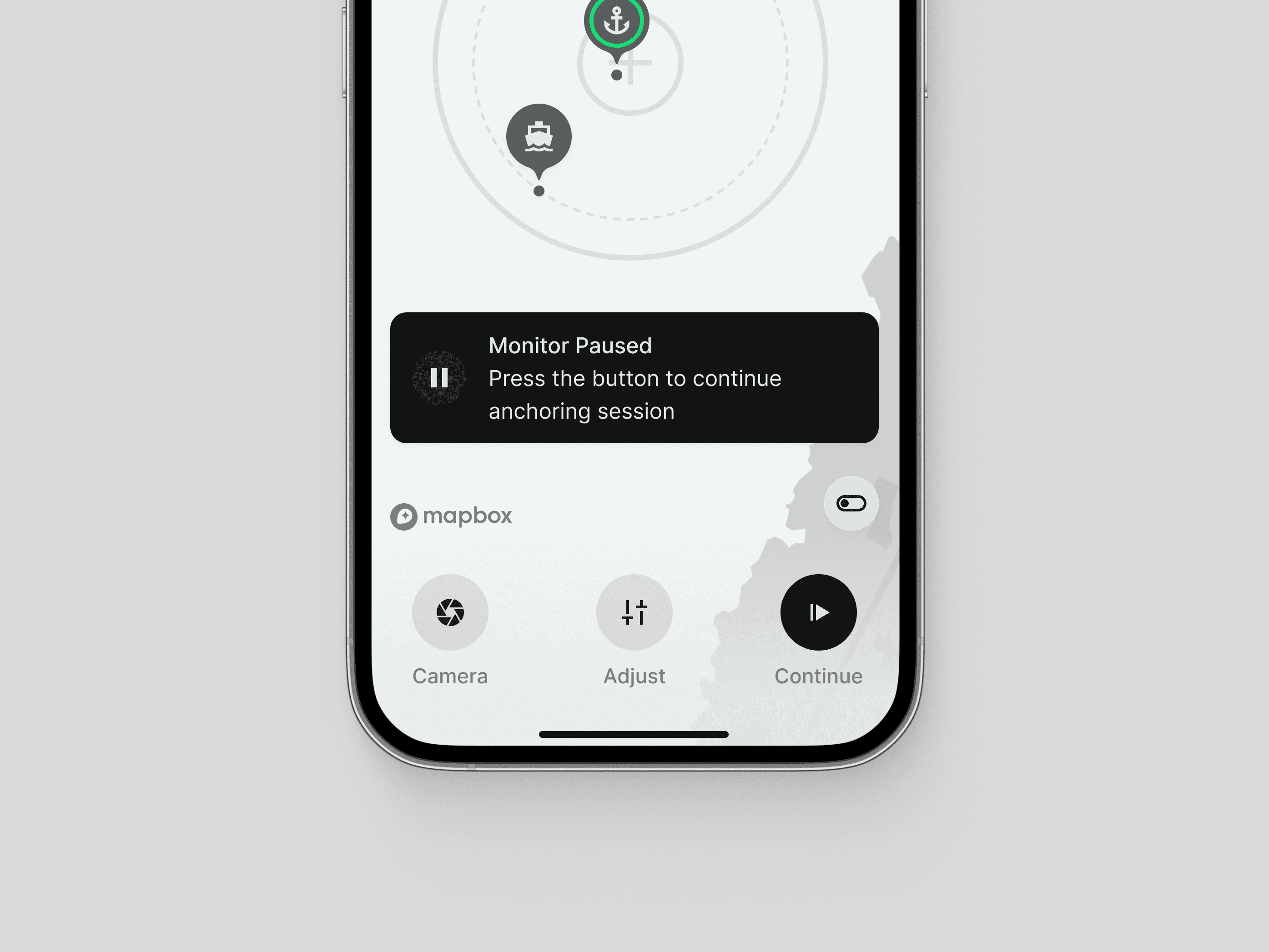
We prioritized minimizing unwanted and potentially costly mistakes (who wants to hear the sound of a crash, realizing the anchor alarm was deactivated?). To illustrate, deactivating the anchor monitor requires a two-step confirmation with a held press on the "terminate" button, alternatively, pausing the monitor triggers an alert banner that cannot be dismissed.
We prioritized minimizing unwanted and potentially costly mistakes (who wants to hear the sound of a crash, realizing the anchor alarm was deactivated?). To illustrate, deactivating the anchor monitor requires a two-step confirmation with a held press on the "terminate" button, alternatively, pausing the monitor triggers an alert banner that cannot be dismissed.
We prioritized minimizing unwanted and potentially costly mistakes (who wants to hear the sound of a crash, realizing the anchor alarm was deactivated?). To illustrate, deactivating the anchor monitor requires a two-step confirmation with a held press on the "terminate" button, alternatively, pausing the monitor triggers an alert banner that cannot be dismissed.






Map Styles
Map Styles
Map Styles
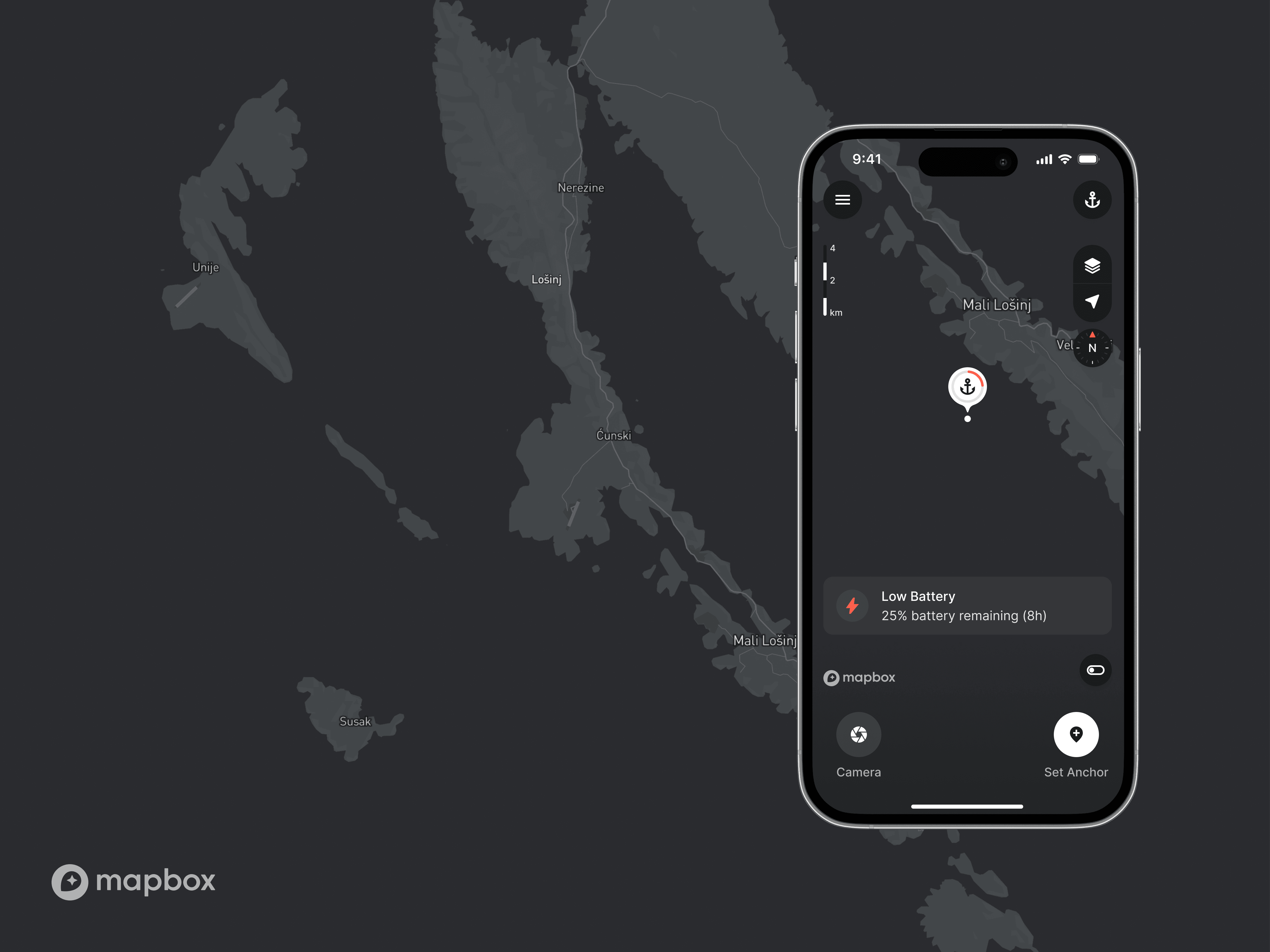
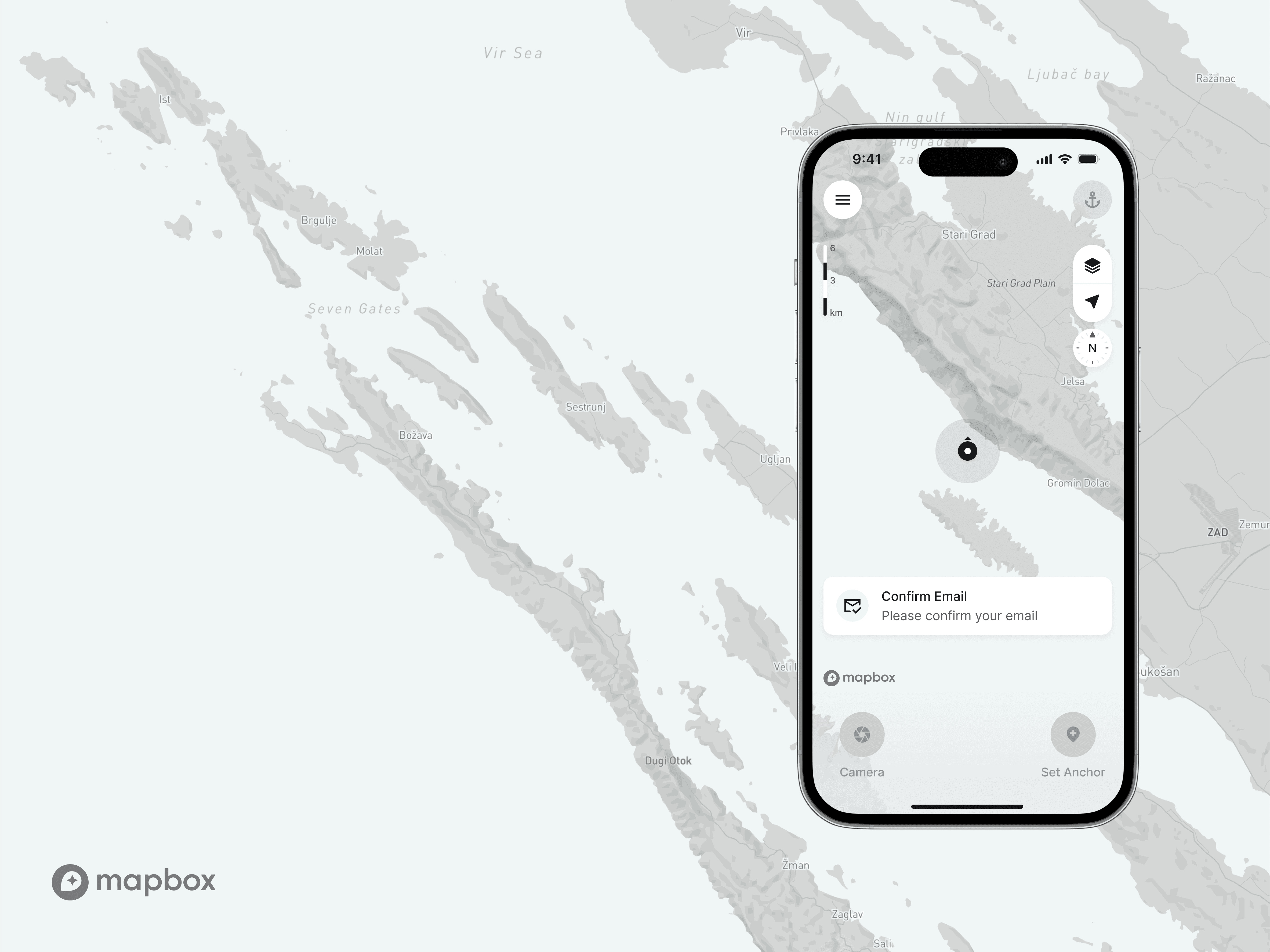
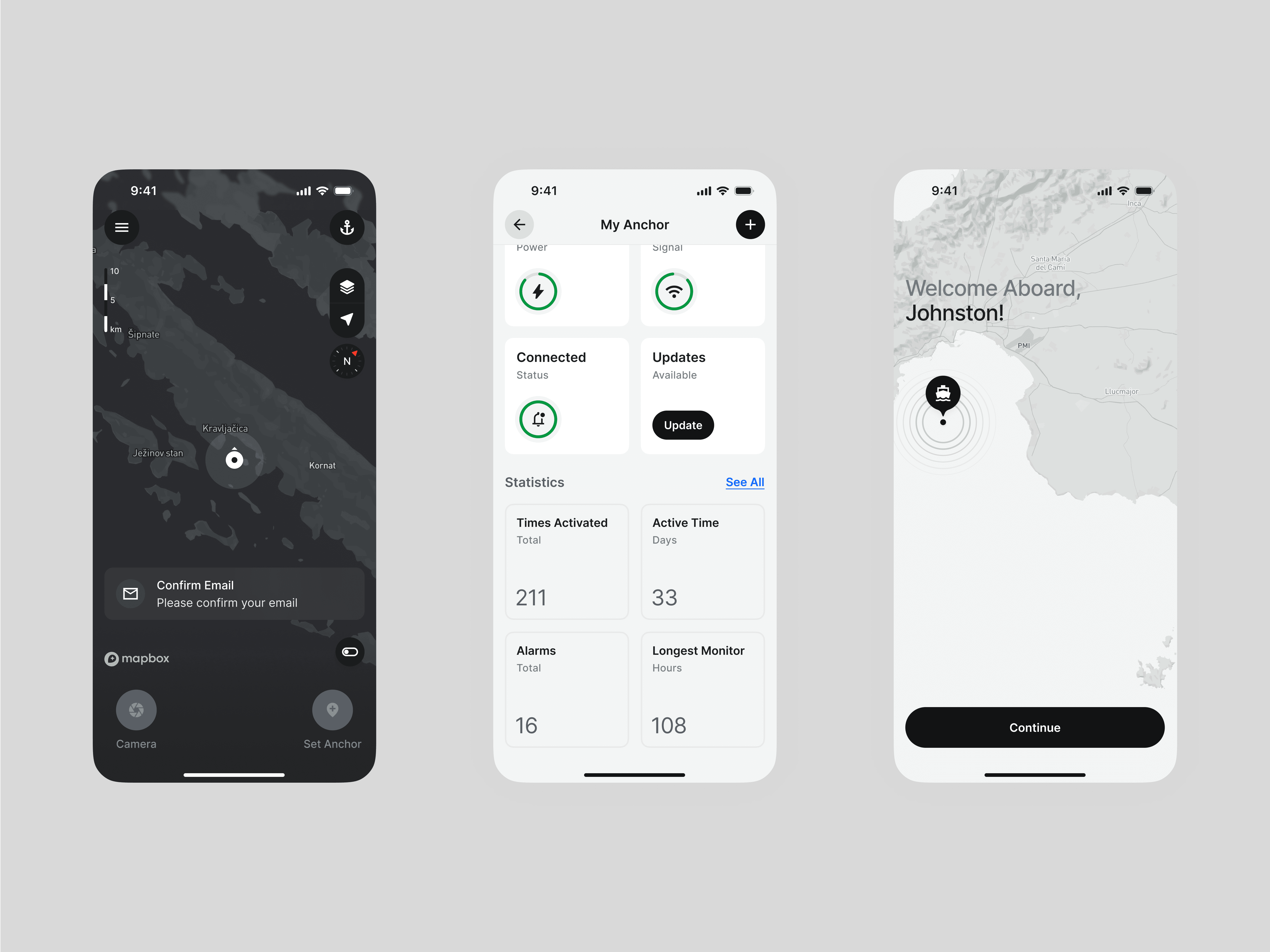
Unlike most interactive maps, where navigation is their main function, this map's primary purpose is to differentiate between safe (water) and dangerous (shore) areas. Users typically interact with it on a very small scale, within 0-100 meters, causing water area to dominate the screen space. This allowed us to simplify map styles and align them closer to the VisionAnchor brand style. The maps were customized in Mapbox Studio and will be initially offered in light and dark mode, without satellite style.
Unlike most interactive maps, where navigation is their main function, this map's primary purpose is to differentiate between safe (water) and dangerous (shore) areas. Users typically interact with it on a very small scale, within 0-100 meters, causing water area to dominate the screen space. This allowed us to simplify map styles and align them closer to the VisionAnchor brand style. The maps were customized in Mapbox Studio and will be initially offered in light and dark mode, without satellite style.
Unlike most interactive maps, where navigation is their main function, this map's primary purpose is to differentiate between safe (water) and dangerous (shore) areas. Users typically interact with it on a very small scale, within 0-100 meters, causing water area to dominate the screen space. This allowed us to simplify map styles and align them closer to the VisionAnchor brand style. The maps were customized in Mapbox Studio and will be initially offered in light and dark mode, without satellite style.
Light and Dark Mode
Light and Dark Mode
Light and Dark Mode
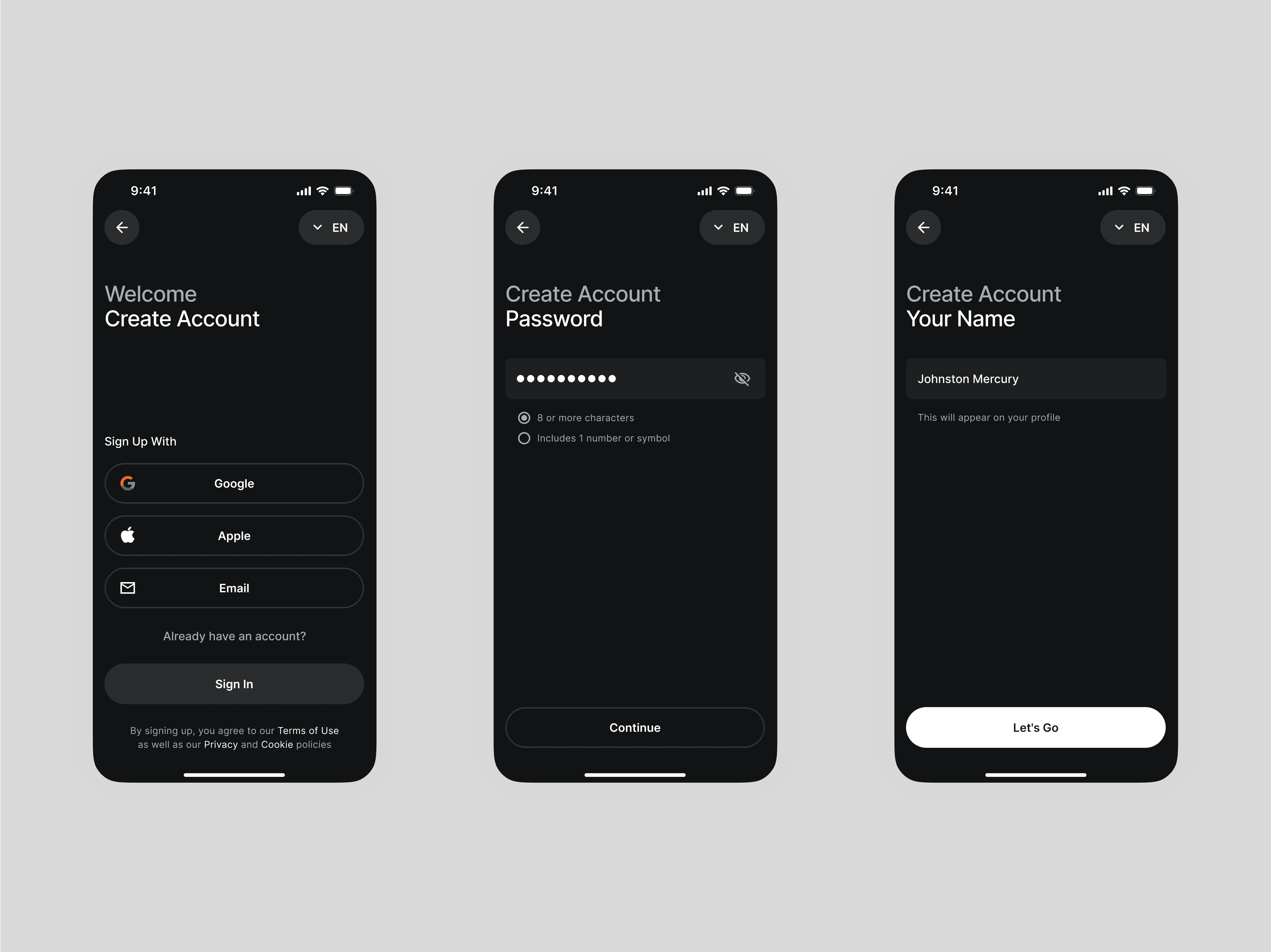
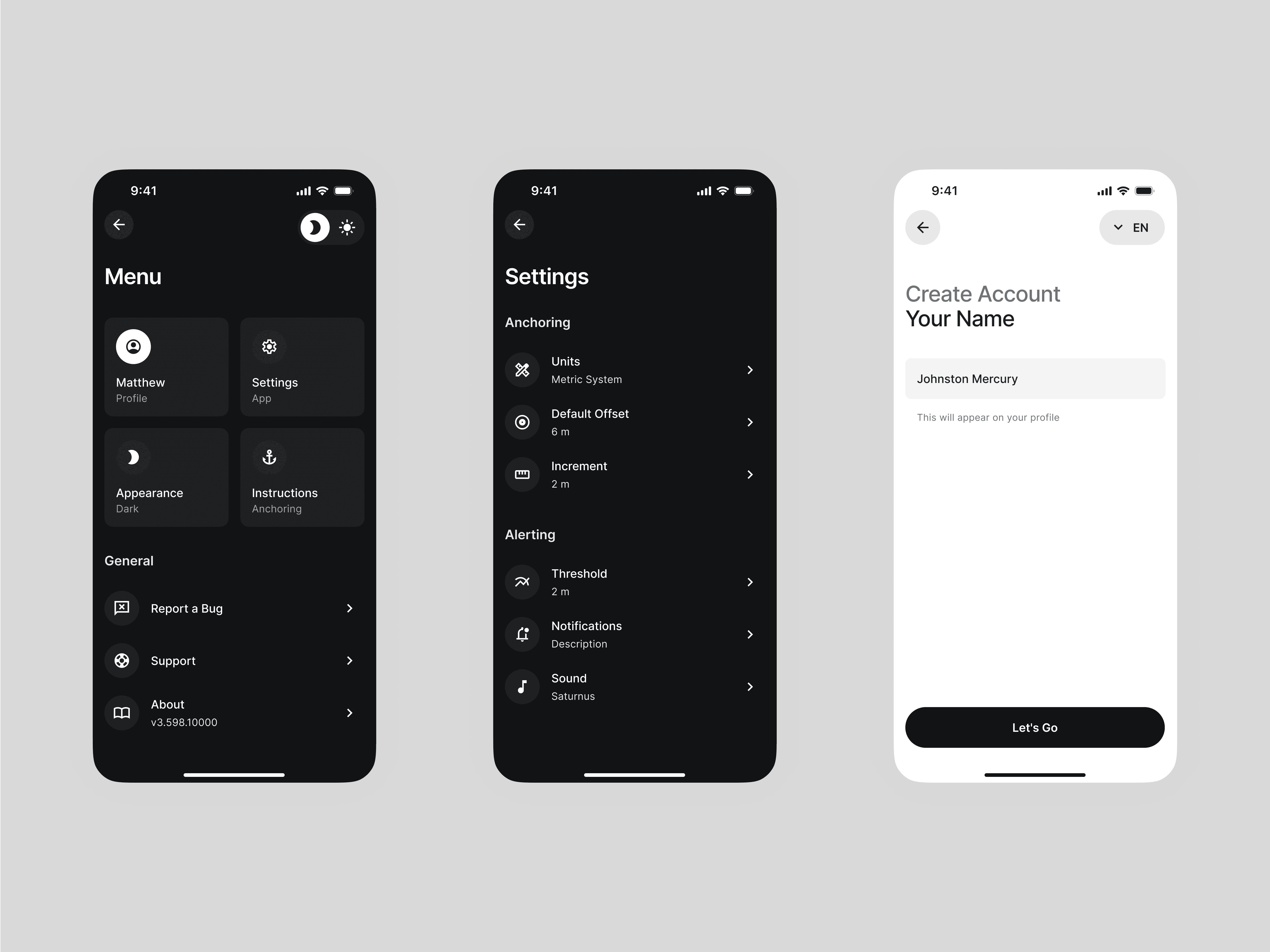
The fact that anchoring relies on visual assessment and can take place in the evening hours or during the night means we needed to offer the dark mode right from the start. The app switches between light and dark modes automatically, as it is scheduled by being connected to GPS and calendar data. Users are, of course, allowed to switch between modes manually.
The fact that anchoring relies on visual assessment and can take place in the evening hours or during the night means we needed to offer the dark mode right from the start. The app switches between light and dark modes automatically, as it is scheduled by being connected to GPS and calendar data. Users are, of course, allowed to switch between modes manually.
The fact that anchoring relies on visual assessment and can take place in the evening hours or during the night means we needed to offer the dark mode right from the start. The app switches between light and dark modes automatically, as it is scheduled by being connected to GPS and calendar data. Users are, of course, allowed to switch between modes manually.






Setting Up Scalable Token Inventory
Setting Up Scalable Token Inventory
Setting Up Scalable Token Inventory
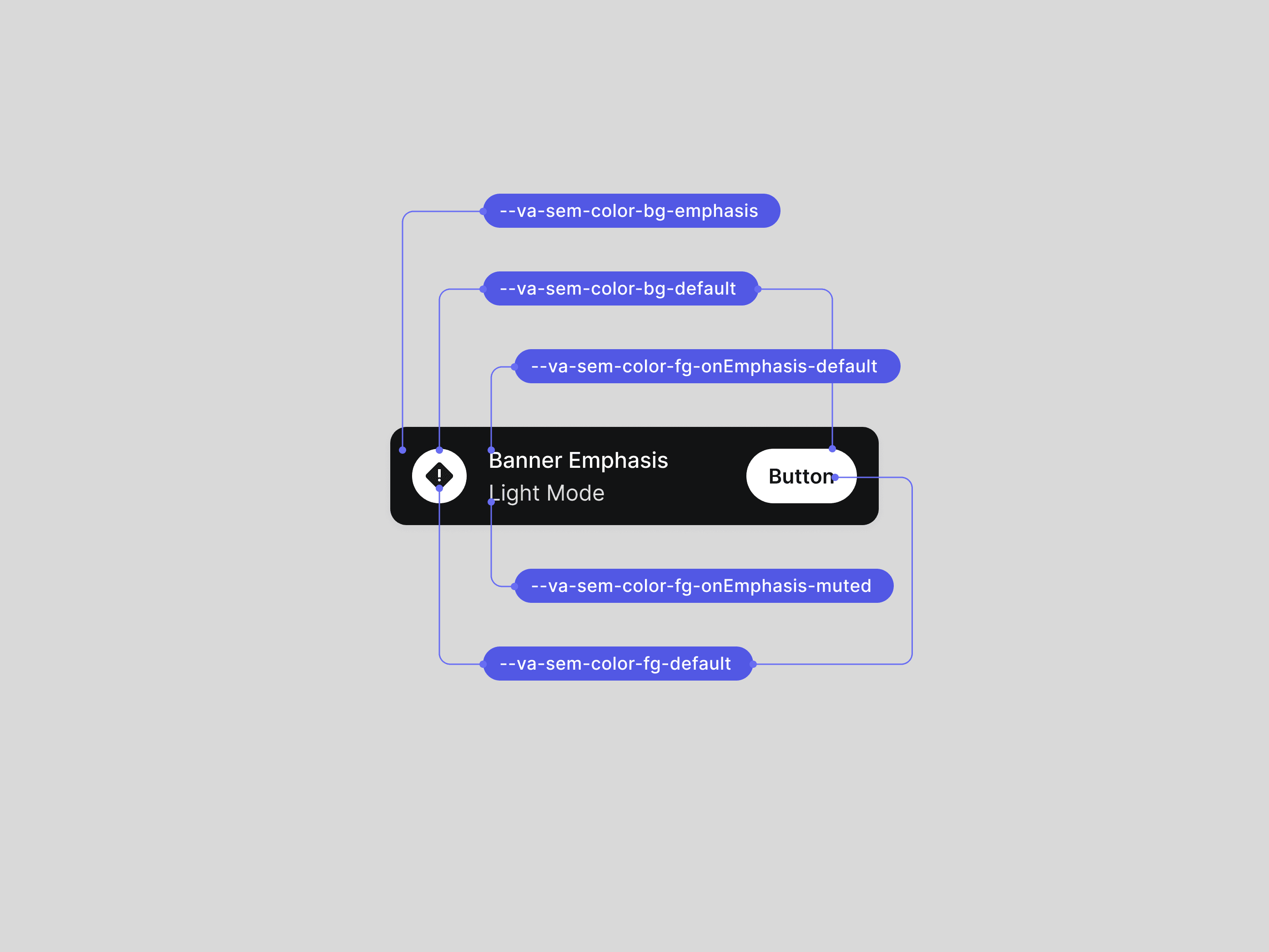
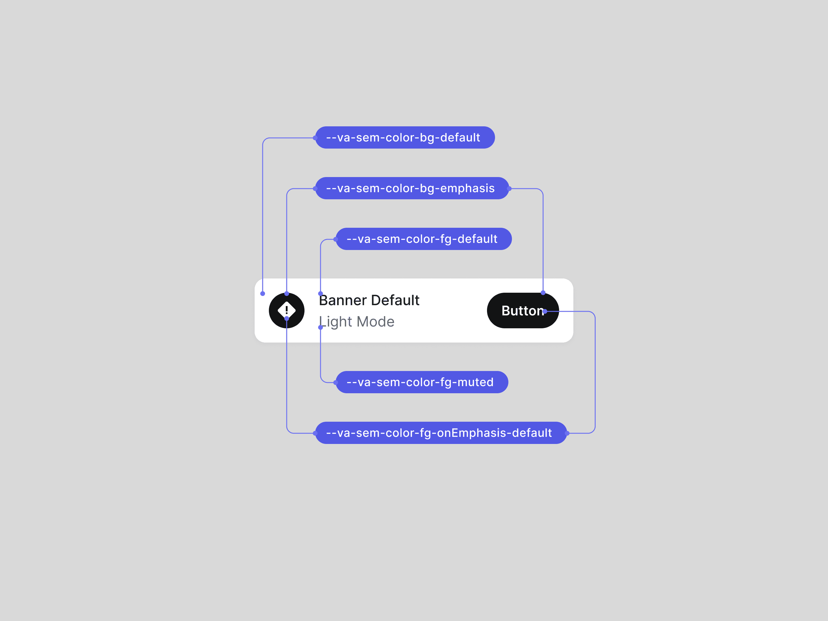
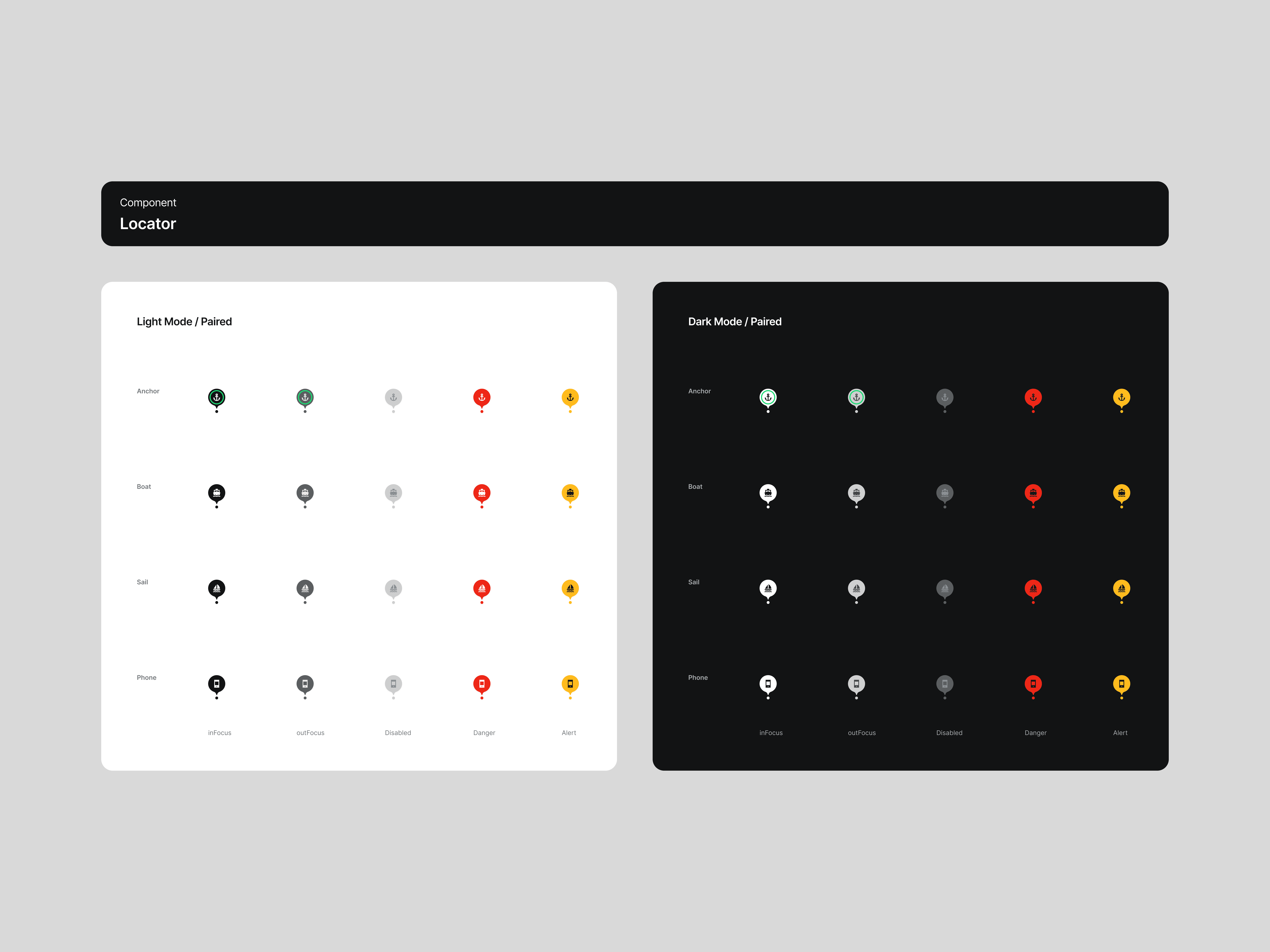
When establishing a design tokens inventory for a startup's digital product, it's essential to recognize that you're likely at the outset of their product journey. Therefore, the system must be inherently simple, adaptable, and scalable to accommodate inevitable changes and future growth.
To achieve this, I employed a property-based naming logic, inspired by design systems like Primer (GitHub). This method groups color tokens by the interface element's property (backgrounds, foregrounds, borders, charts, etc.) with variant and state modifiers ($va-semantic-color-bg-default-pressed). Importantly, I minimized the use of component-level tokens, since they increase complexity and hinder adaptability.
For success, this approach will require supporting design documentation, which is planned for the near future.



07
Credits
07
Credits
07
Credits
07
Credits
FOUNDERS
Matija Jašarov (CEO)
Anže Peklenk (CTO)
Andrej Podbevšek (CMO)
ENGINEERING
Dr. Aleš Jaklič
Petra Maršič
Matic Tomaževič
DESIGN
Gašper Uršič
PHOTOS
Marko Ocepek